Strapi PageBuilder V.1.2
1. Introduction
This guide will introduce you to all the functions that are important for using the PageBuilder settings. PageBuilder is a WYSIWYG editor in the frontend, which stands for "What you see is what you get" and means that the page looks the same when you edit it as it does when it is finished. However, this only works if you have stored settings for this in the PageBuilder backend.
We will show you the user interface and the most important functions for adjusting and creating colors and fonts. This documentation will introduce you to the store-, content-element- and global-settings.
The general appearance of the page is predefined by you as the developer or designer in the PageBuilder backend. The Content Manager only has the option of selecting the respective content elements from the colors, fonts and spacing you have predefined in the configuration pop-up.
2. Strapi PageBuilder Settings
The Strapi PageBuilder backend contains several content types to make settings, where you will mainly work with these three settings:
- Store Settings
- Global Settings
- Content-Element-Settings
These settings determine the look and feel and behavior of the entire page as well as individual content elements.
In addition, there are custom css and additionalcss for further, more extensive settings to customize your website to your needs.
| Rule of thumb | What should be adjusted? |
|---|---|
| No Content-Element | Search for setting in Global Settings |
| Content-Element | Search for setting in Content-Element Settings |
3. Content Types
3.1 Store-Settings
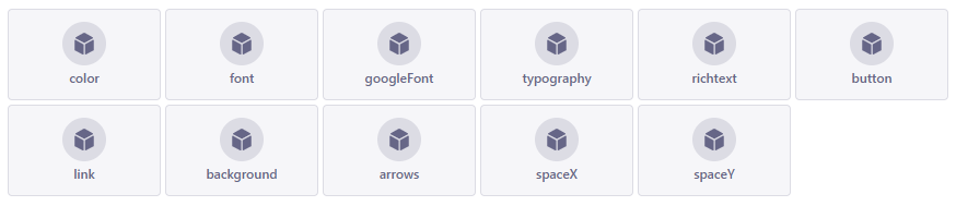
The Store Settings are used to set up basic settings such as colors and fonts that can be applied to Content Element Settings and Global Settings.
Below you can see the most important settings that can be set in the PageBuilder backend:
| Setting | Description |
|---|---|
| color | To define colors via color picker |
| font | Uploading and creating fonts in .ttf format |
| googleFont | Upload and create Google fonts via googleFontCssImport |
| typography | To create typography with the previously uploaded fonts to define a hierarchy of headline tags (H1 to H6) and paragraph (P tag). |
| richtext | Contains settings for text formatting, such as bold and left-alligned. You associate these later with the "Richtext" content element. |
| button | Settings for buttons such as font, color, button width/height and hover effects |
| link | Settings for links such as font, color and hover effects are set here |
| background | Background images that you can later apply to content elements |
| arrows | The left and right arrows for the Carousel and Gallery content elements are defined here |
| spaceX | The horizontal (left/right) distance to the layout |
| spaceY | The vertical (top/bottom) distance to the elements above and below a content element |
3.2 Global-Settings
DThe name Global Settings is already very descriptive here. Here you make one-off settings that affect the entire site. These include the size and color of the navigation or the background color of your entire website via layout settings.
To access the global settings, click on the menu item global.
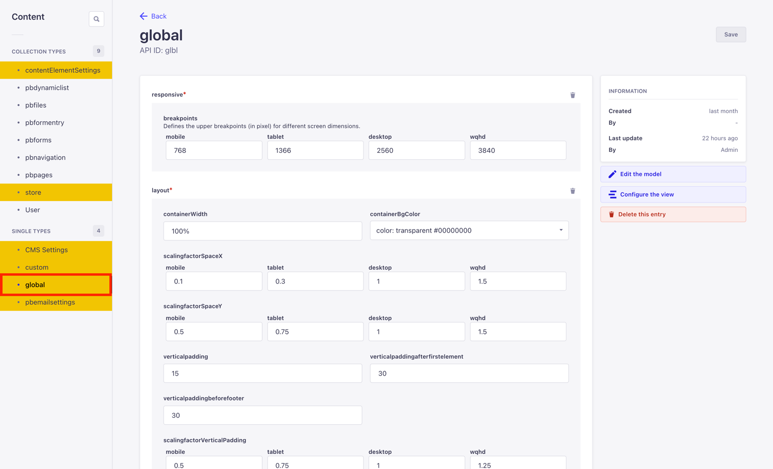
Further setting options in the global settings:
| Function | Description |
|---|---|
| responsive | Determines the breakpoints of your page, for example when it switches to MobileView. |
| layout | In the layout you determine, among other things, the spacing and size of your content as well as the background color. |
| navigation | Here you determine the appearance of the navigation. To customize the navigation according to your exact wishes, simple CSS knowledge is required here. |
| footer | Settings for the footer and social media. You can also enter a copyright line in various languages here. |
| seo | SEO optimizations, such as settings for image optimization or whether links should always open in a new tab.. |
| logo | To display favicons in different sizes and on different platforms, upload them via the Media Manager. |
| forms | As the rich text editor is also used in forms, simply select your rich text content element setting here. |
| search | Use search to determine the appearance of the search bar in the navigation and the magnifying glass. |
| searchresults | Determines the appearance of the search results on your site, according to your wishes. |
| multilanguage | If your site serves several languages, you can define the appearance of your languageSwitch that is displayed in the navigation here. |
| animation | Settings for when animations are activated on the page or when animations are also displayed in Mobile View. |
| scrolling | Here you determine how the entire page behaves when scrolling. |
| scrolltotop | With scrolltoptop you configure a graphical button with which your users scroll to the top of your page. |
| captchatype | Here you can set whether a captcha should be used and what type (e.g. Google Captcha). |
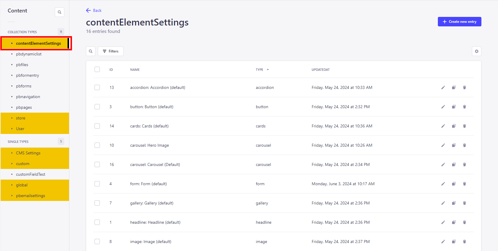
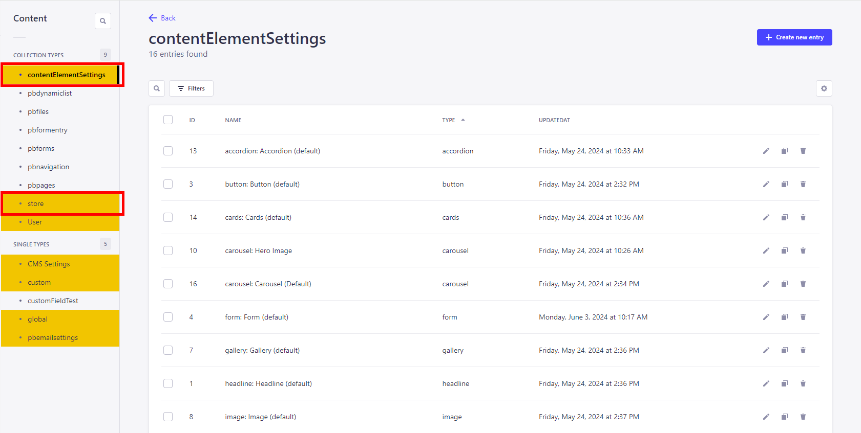
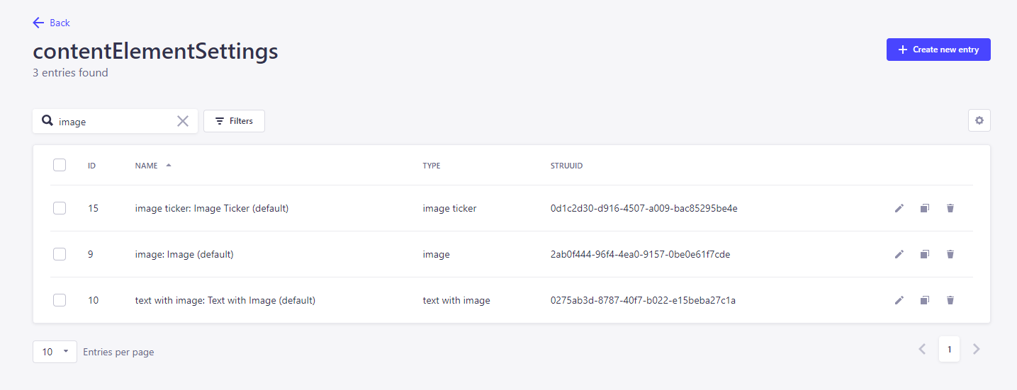
3.3 Content-Element-Settings
Content elements are a type of building block that you use to determine the structure of your page. They are individual elements that are used to place a headline or images on a page, for example.
Within the content elements, configuration popups are used to make further settings that you have previously defined via the store and content element settings.
These include colors, fonts and typography.To access the content element settings in the backend, click on the menu item contentElementSettings.
Hint: The PageBuilder Content Management Documentation explains the individual content elements in more detail.
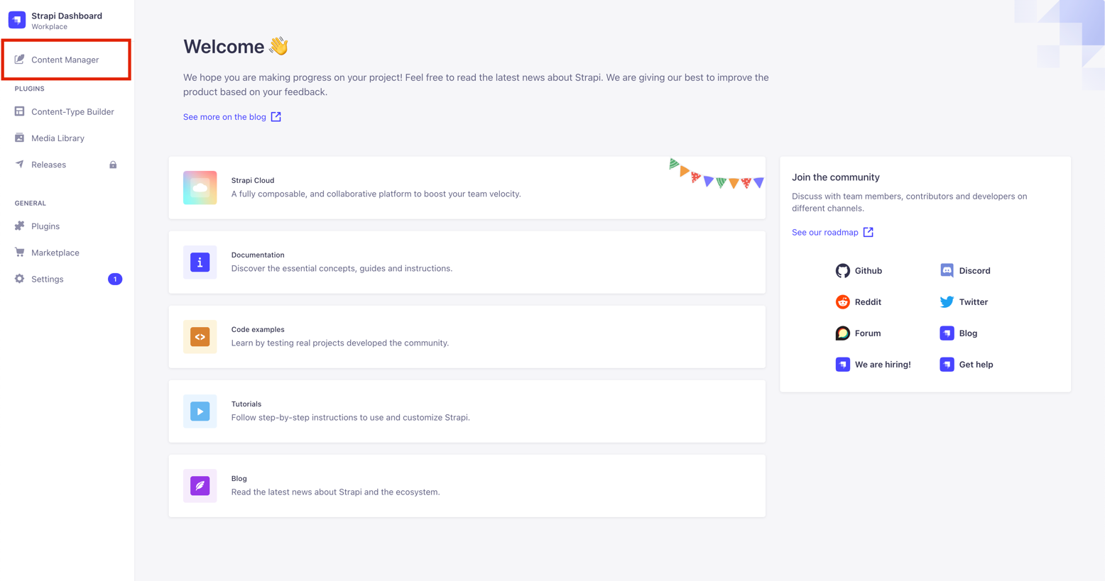
4. After the Login
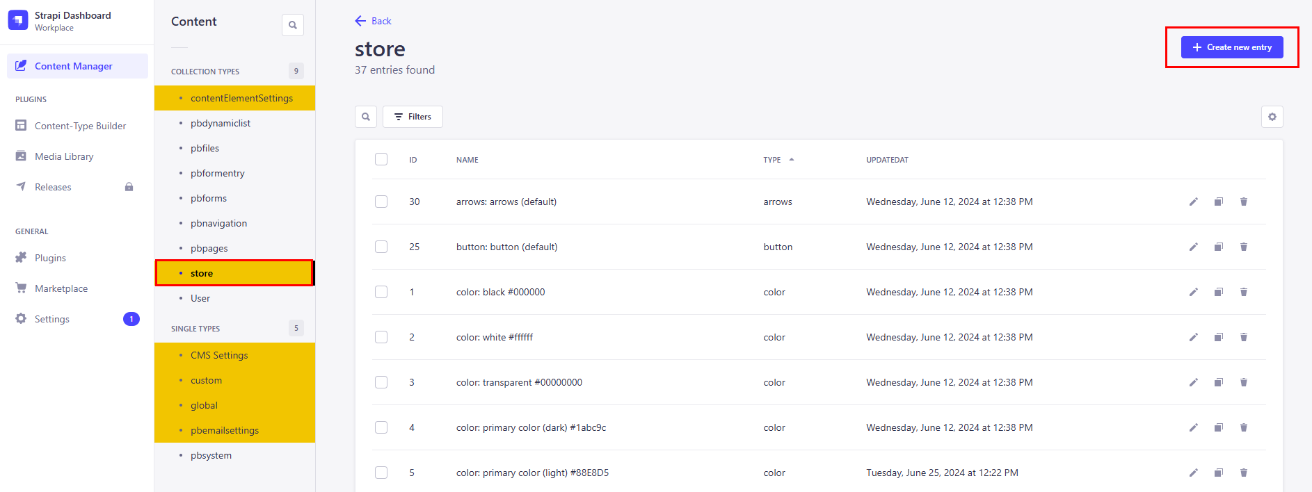
Now that you have become familiar with the individual content types, we will show you how to customize them. After logging into the Strapi backend, click on Content Manager.
In menu level 2, click on contentElementSettings or store – the view changes to an overview of the existing store or content element settings.
5. Default-Settings
As soon as you are in the respective settings overview, you will see pre-configured settings that are delivered directly with the PageBuilder plugin installation package.
In the rest of this documentation, we will refer to these settings as default settings. You can recognize these settings (except font and color) by the ending (default).
You can adapt the default settings to your own requirements at any time.
Hint: You can recognize predefined default components for quick access by the specification (default) in the content type name. Example: button: button (default)
5.1 Editing (default) store- and content element-Settings
To get to know the individual settings better, we recommend that you adjust the default settings first. There is also a certain sequence, see further down this text to learn more, that makes sense when adjusting the default settings, as many settings build on each other and interlock.
Here you can see a list of the store settings if you click on +create new entry in the store settings
It is best to create or edit the components in the order shown in the screenshot. For this reason, we will focus on the following three store settings for the first steps, as these settings are almost always also used in other store and content element settings:
| Function | Description |
|---|---|
| color | Default-Settings: primary (dark and light), secondary (dark and light), accent and background (dark and light) colors. For example, the primary color determines the color of the typography default component. |
| font | Allows you to upload your own fonts in .ttf format. |
| typography | Typography determines, among other things, the appearance of the HTML headline hierarchy H1 to H6, the font size of font formats and draws colors and fonts from the previously mentioned components color and font. |
Hint: You can find out more about the individual store settings in chapter 2.
- Use the „store“ menu item to access the store settings
- Now select primary color (dark) for editing in the overview.
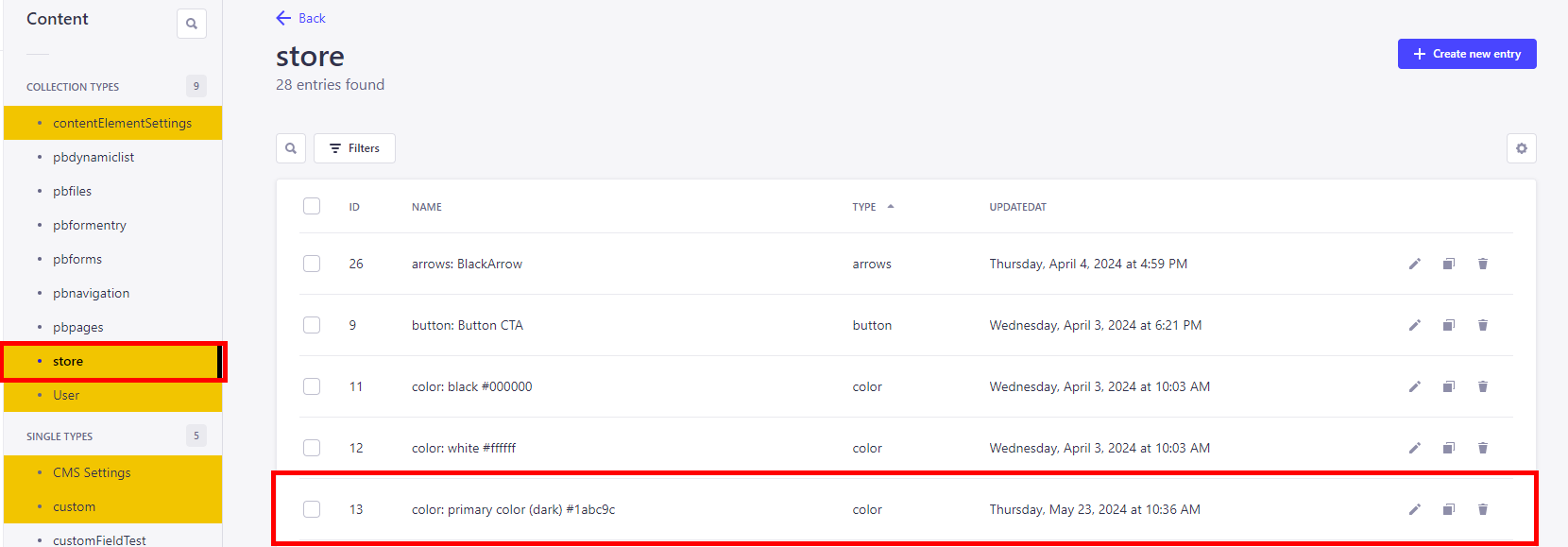
- The view switches to edit mode by clicking on the name of the setting or on the pencil icon on the far right.
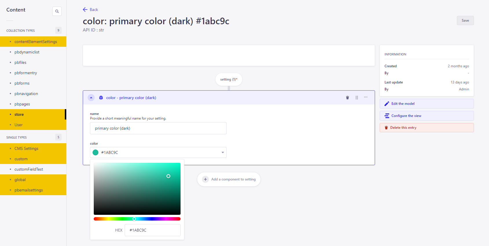
- You can assign a new name for the setting via the name field.
Hint: We recommend using meaningful names so that settings can always be found quickly.
- Then select the color in the color field - either using the color picker or by entering a valid HEX value.
- Use the save button to save your changes. The first color is now adjusted.
- You can now edit other default colors (e. g. secondary color)
Warn: After saving, the current editing view remains open! If you now enter new values, no new setting is created, but the currently open setting is edited.
5.1.1 Weitere Bearbeitungsmöglichkeiten
Further editing options in additional to editing, you can also duplicate or delete settings in the overview.
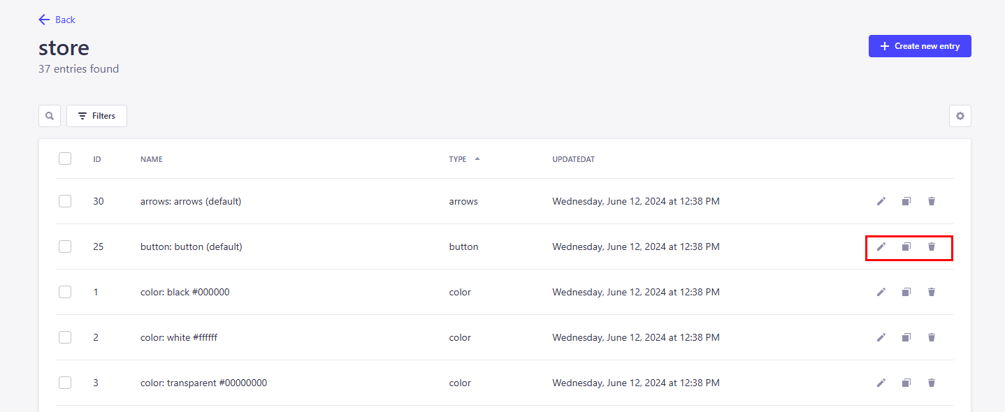
| Function | Description |
|---|---|
| Duplicate | When duplicating, the selected setting is adopted and the editing menu opens directly where you can make new settings. |
| Delete | If delete is selected, a pop-up appears in which you must confirm the deletion. If you click on the "Confirm" button, the element is irrevocably deleted. |
5.2 Creating new store and content element settings
If the default colors supplied are not sufficient, you can create new store settings at any time:
- Open the store settings via the link store.
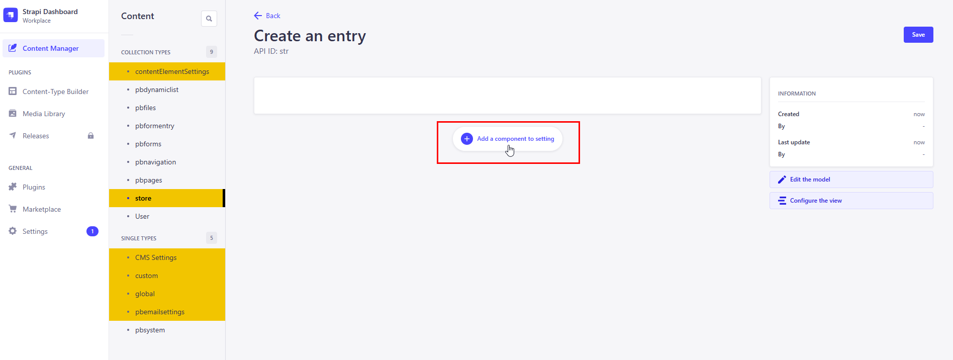
- Click on the button +create new entry. A new page will open.
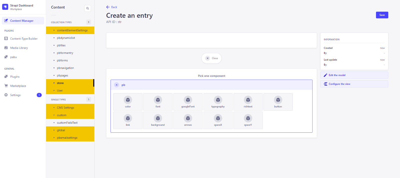
- Click on the button add new component. The page now shows all available store settings
- Select the desired component here, in this example color. The editing mode opens.
- As when editing store settings from chapter 2, enter a descriptive name in the name field.
- Select the desired color from the color field or enter a HEX value.
- Then save with the save button.
- Your newly created color will now appear in the store overview.
Hint: Creating and editing the content element settings works in the same way.
Warn: After saving, the window remains open! If a new value is now entered in one of the fields, only the previously saved setting is overwritten. No new setting is created!
5.3 Adding store settings to content element settings, global and other store settings
You now know how to create and edit store and content element settings. Now we will show you how to use them in other settings.
- You have edited the primary-color (dark) in the store-settings.
- Now switch from the store-Settings to the contentElementSettings and edit here the seperator: Seperator (default)
- You willl see a dropdown under bgColors in which you can see all the colors you have created so far - including the primary color (dark).
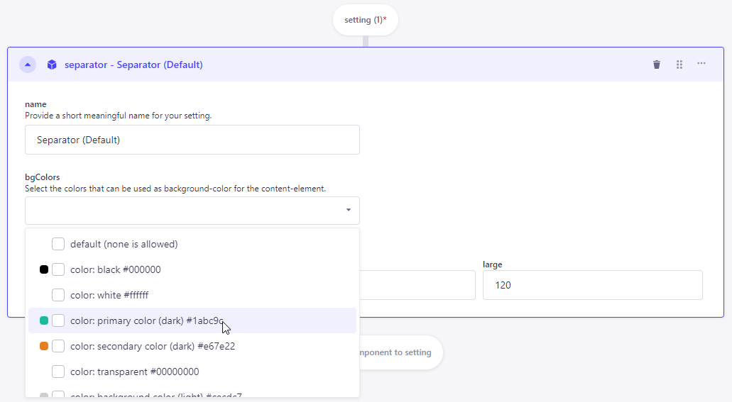
- since graphic elements with up to two colors can be adjusted in the separator content element, also select another suitable color.
- As with bgColors in this example, you can also add other store settings such as SpaceX or typography by simply adding them via a dropdown.
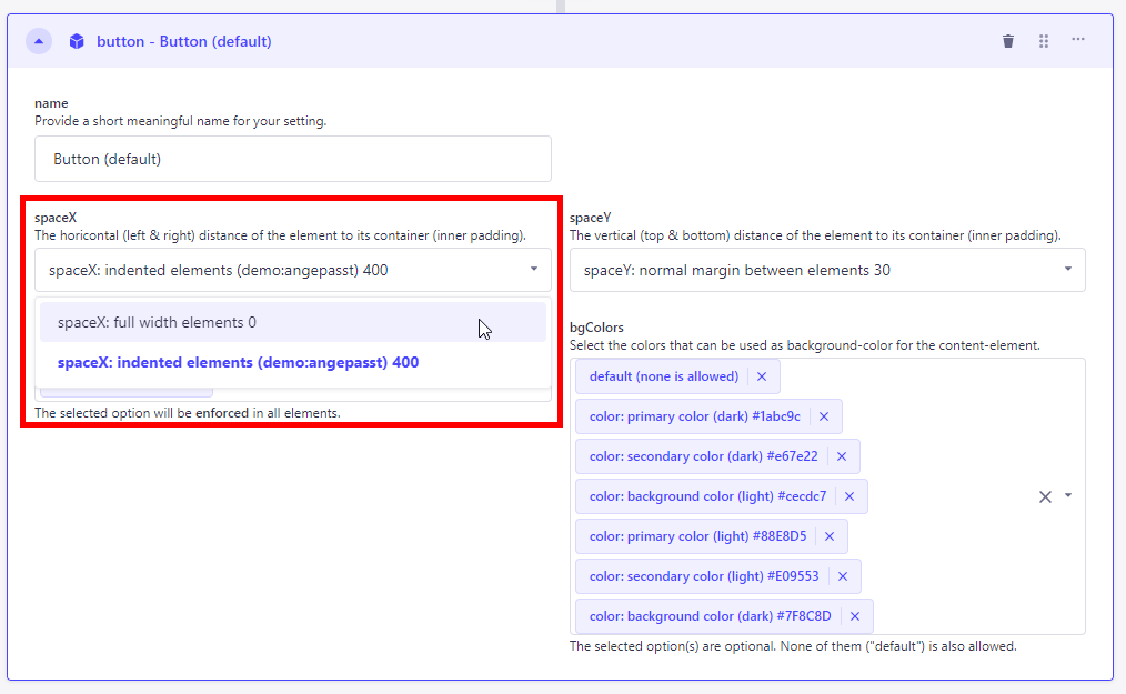
- Individual elements can also be removed again. Either by an x next to the component (as with colors) or by another selection in the dropdown (as with SpaceX).
5.4 Effect on the frontend, through settings in the PageBuilder backend
Depending on their role allocation, development and/or design managers determine the layout decisions (colors, fonts and typography) in the PageBuilder backend, which are available to content management in the frontend via configuration modals.
The frontend cannot decide for itself whether a certain font or color is used in the content elements if this has not been set accordingly in the backend. In this way, use is restricted to approved elements that correspond to your desired corporate identity. This prevents incorrect decisions.
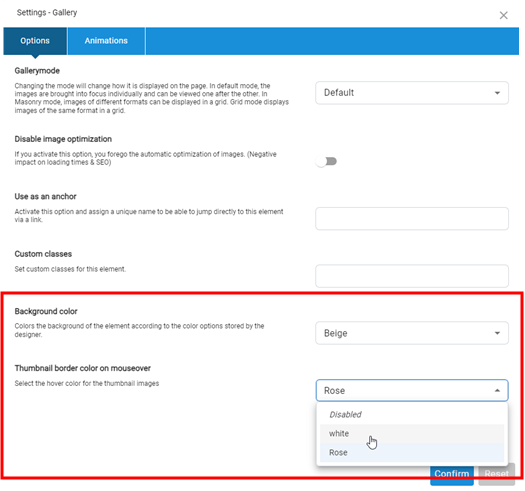
The following example illustrates the effects of design decisions on colors selected for the content element gallery:
- All colors that were created in the store settings in the hoverColors dropdown are available for the gallery content element in the PageBuilder backend.
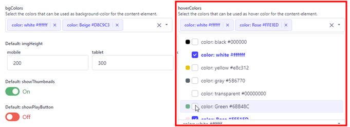
- Now decide to make only the colors white and rose available as hoverColors options for content management. In the bgColors field, these are the colors white and beige.
- If the content management in the PageBuilder frontend opens the configuration modal for the content element Gallery, there are only the bgColors options white and beige in the pool of created colors, for hoverColors, as selected and shown in the screenshot, white and rose
As soon as you have adjusted the colors, fonts and typography, you can view the first results in the PageBuilder frontend.
- The CMS user login takes you to the PageBuilder frontend.
- Use the context menu Add > Add page to create a new content page. In edit mode, place new content elements using the large "Add new element" button.
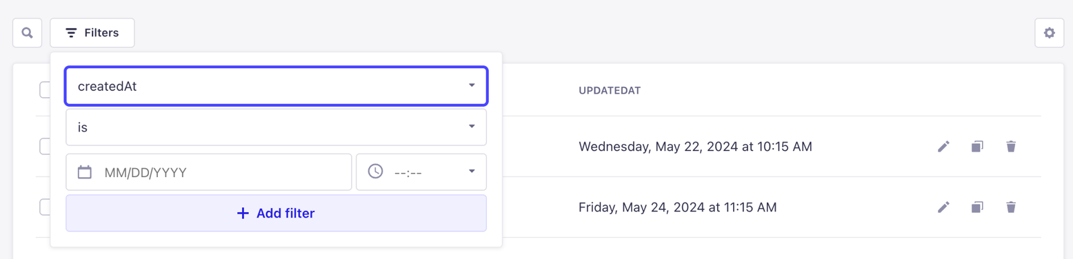
5.5 Search
As the list of settings can quickly become confusing and to make it easier to search for specific settings, you can not only search for specific keywords such as "image" in this example, but also filter specifically by attributes such as the creation date within the filter.
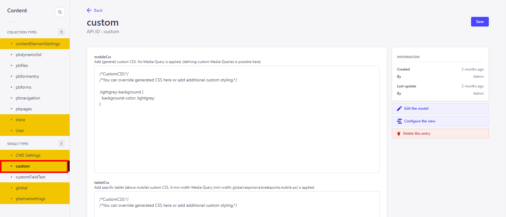
6. Custom CSS
Custom CSS is used when certain elements are to be styled in the frontend that cannot be influenced via the global settings or the store settings. These include, for example, bullet points or animated
| Function | Description |
|---|---|
| mobileCss | Adding (general) user-defined CSS. No media query is used (it is possible to define your own media queries here). |
| tabletCss | Add specific custom CSS for tablets (via mobile). A min-width media query (min-width: global.responsive.breakpoints.mobile px) is applied. |
| desktopCss | Add specific custom CSS for desktop (via tablet). A min-width media query (min-width: global.responsive.breakpoints.tablet px) is applied. |
| wqhdCss | Add specific WQHD (via desktop) custom CSS. A min-width media query (min-width: global.responsive.breakpoints.desktop px) is applied. |
6.1 Additional CSS
Additional CSS is possible in the following global settings.
| Function | Description |
|---|---|
| navigation | The additionalCSS for the navigation is very extensive, as you make all the necessary settings here via CSS, for example to determine the padding of the submenus. A basic knowledge of css is advantageous here. |
| footer | Defines CSS that is applied in addition to the configuration. |
Additional CSS is possible in the following store settings.
| Function | Description |
|---|---|
| typography | By default, letter-spacing: normal; text-transform: none; can already be set here |
| button | Here you have the choice between two CSS settings. additionalCss with the default setting text-transform: none; and additionalCssHover (with the default setting border: 1px solid #000000; border-radius: 0; |
| link | As with the button, you have setting options for additionalCss and additionalCssHover. CssHover comes with the default settings text-decoration: underline; letter-spacing: normal; text-transform: none; |
| background | Here, too, you have setting options for additionalCss and additionalCssHover. Css and cssHover come without default settings. |
| arrows | The arrows have an arrowSvgFilterCssAttribute and therefore already have a drop-shadow default drop-shadow(0px 3px 2px rgba(134, 134, 134, 0.6)). |
Additional css is possible in the following content element settings.
| Function | Description |
|---|---|
| form | Here, too, you have setting options for additionalCss and additionalCssHover. Css and cssHover come without default settings. |
| gallery | The gallery elements have a default: fullScreenIconFilterCss and therefore already have a drop-shadow default drop-shadow(0px 3px 2px rgba(134, 134, 134, 0.6)). |
7. Assets
Uploading images and fonts works a little differently in the Strapi backend than in the PageBuilder frontend via the Media Manager.
7.1 Adding assets using the Global Settings Favicon example
- Scroll to the "Logo" item in the Global Settings
- You will find the 32x32 favicon there. The asset you upload does not have to correspond to this size and will be scaled to this size.

- Now you can drag and drop or click to select and upload a new asset
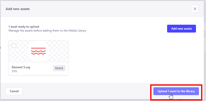
- The view changes slightly and a check mark is automatically placed next to the uploaded asset.
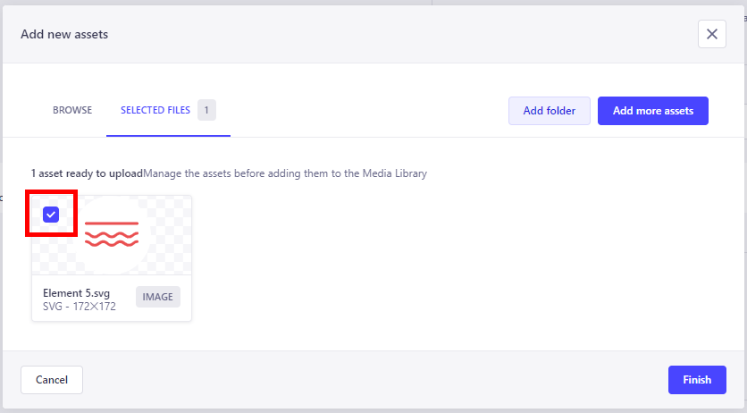
- The image is then used as a favicon via Finish. It can be edited there at any time.

8. Import/Export
The Basic and Import/Export tabs can be seen via the Strapi Dashboard in the PageBuilder menu item.
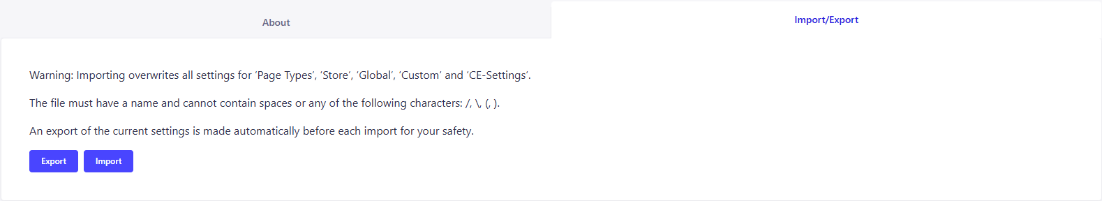 These functions allow you to transfer a settings set between two environments without having to transfer settings manually.