Strapi PageBuilder V.1.2
1.Introduction
This step-by-step guide will introduce you to all the functions that are important for using the PageBuilder. The PageBuilder is a WYSIWYG editor, which stands for "What you see is what you get" and means that the page looks the same when you edit it as it does when it is finished. This means that you can always see and check your process in real time.
We will start by showing you the user interface and the most important functions for uploading images and creating forms. In the last chapter of this documentation, you will also be introduced to the content elements that are essential for the structure of a page.
The general appearance of the page is predetermined by a developer or designer in the Strapi backend. As a content manager, you only have the option of selecting from predefined colors, fonts and spacing in the configuration pop-up of the respective content elements. You can read more about the various content elements in chapter 5. .
Let's start with the view of the user interface after logging in.
After the first login, you will see the root or in other words, a first configuration page, which acts as the first start page. Here you also have direct access to the functions from the context menu.

| Function | Description |
|---|---|
 | 1. Edit: Using the "Edit" button, the user interface switches to the editing mode of the page. |
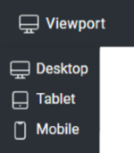 | 2. Viewport: Select here from which view you want to see the page: - Desktop - Tablet - Mobil. |
 | 2. (Pages-)Dropdown: Use this dropdown menu to access all pages created within your Strapi project. Non-published pages are also listed here. The globe symbolizes the start page in the dropdown. |
 | 3. Manage: : The "Manage" context menu gives you direct access to the "Pages", "Forms", "Navigation", "Categories", "Page Types" and "Media" overview pages. More on this in the respective chapters. |
 | 4. Add: New content is created by clicking on "Add". Currently, it is only possible to select "Add Page" via this selection. |
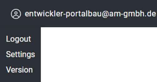 | 5. User-Profil: The profile picture and the login e-mail address of the logged-in profile. With one click you can - log out of your Content Manager account, - change the display of the settings from pop-up to linked menu, - display the software version. |
 | 6. Language: You can choose from all activated languages via the drop-down menu. The default is English. |
2. Edit Mode
Use the Edit button to open the edit mode of the page you are currently on. Here you can edit all placed content elements, add more and make configurations. The footer can also be customized here.
Learn: You can find out more about content elements and how to edit them in Chapter 5 - Content elements.
| Function | Description |
|---|---|
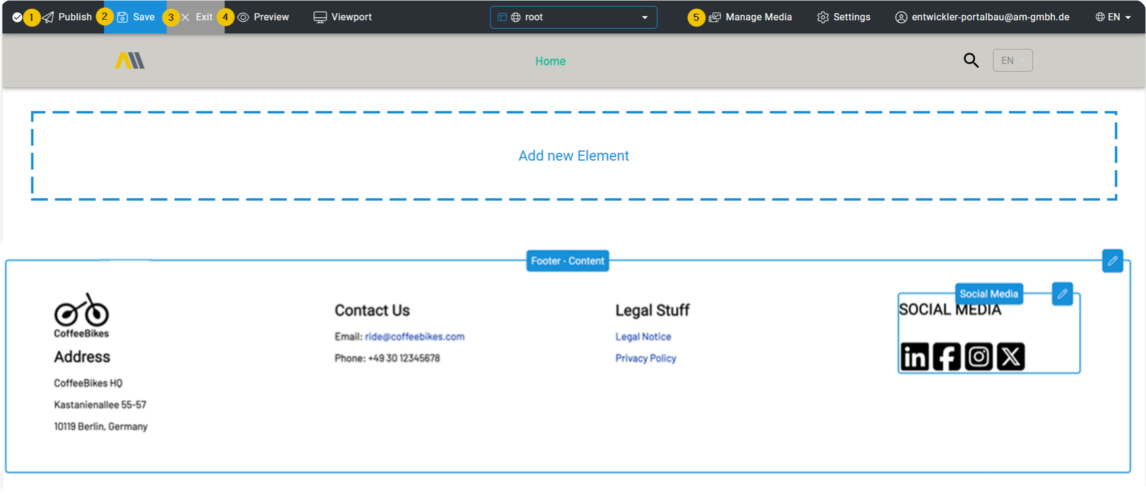
 | 1. Publish: Use the "Publish" button to save all the changes you have made and then publish the page. |
 | 2. Save: Use the "Save" button to save your changes in draft mode. These are not yet published and do not affect the live version of the edited page. |
 | 3. Exit: The "Exit" button closes the editing mode of the page. As a reminder, a pop-up appears with the message that you must save your changes before exiting, as they will not be applied automatically if you do not click on Save.** |
 | 4. Preview: In edit mode, it is possible to switch to the live preview of the current page at any time in order to check the changes to be made directly. This pure WYSIWYG preview of the page has no influence on the status of saving and publishing, this only happens via "Save" or "Publish". |
 | 4A. Edit View: After clicking on "Preview", this button changes to "Edit view". To exit the preview mode, simply click on "Edit view". |
 | 5. Manage Media: Even in edit mode, you can conveniently access the Media Manager at any time to upload additional images or create folders. |
Settings
Click on the gear wheel and use the settings to make the following options and meta settings for the page to be edited:
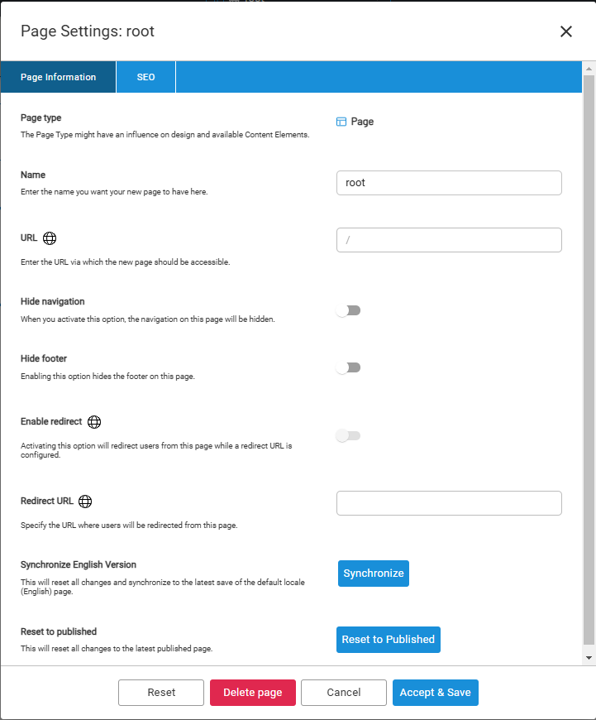
| Function | Description |
|---|---|
| Name | Name of the current page |
| URL | URL of the current page |
| Hide Navigation | Hide or show the navigation |
| Hide Footer | Hide or show the footer |
| Enable redirect | If this option is activated, the user is redirected to the Redirect URL page |
| Redirect URL | Specify the URL to which the user is directed from this page |
| Synchronize English Version | This resets all changes and synchronizes them with the latest saving of the standard page (English). |
| Reset to Published | Changes are reset to the last publication |
| SEO-Tab | The SEO tab with search engine optimizations and meta settings for the current page |
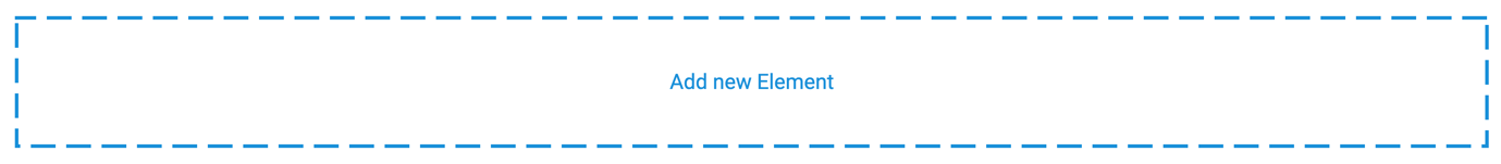
Add new element
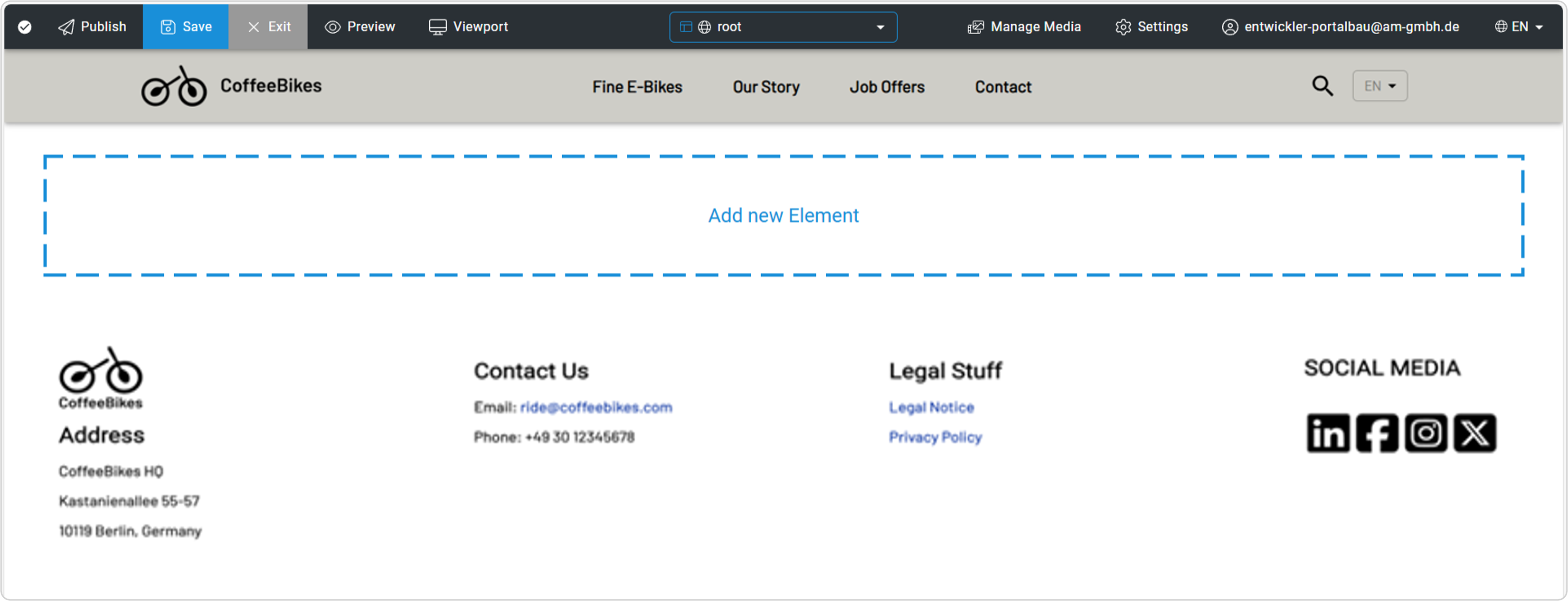
Add new content elements to your page in edit mode using the permanent "Add new element" button at the bottom of the page. This is only visible here in edit mode and is not part of the live page.
Footer
The footer is located at the bottom of every page on your website. It is structured in columns and can usually contain images (such as logos, certificates, etc.), internal and external links, legal information or free text. An extra column for the social media area is also part of the footer.
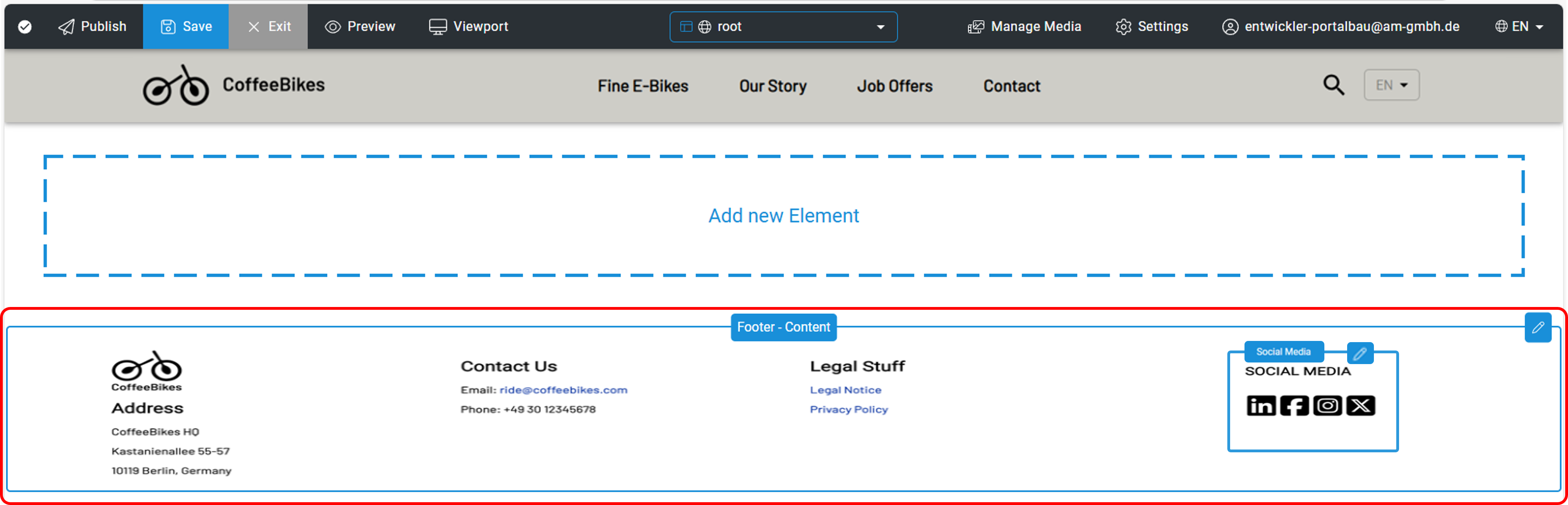
Edit Footer
The footer is structured similarly to a content element. The only difference is that changes to the footer are displayed on every page of the entire website and no more than one footer can be created per website.
Learn: You can find out more about settings in the Settings sub-chapter and more about content elements in Chapter 5 - Content elements.
You activate the separate editing mode of the footer below the large "Add new element" button. A mouseover activates the editing frame with buttons.
Click on the pencil icon on the far right to open the pop-up. If this is the first footer on your website, the "Create list" button will now be displayed. If a footer has already been created on your website, you will be redirected to edit the footer. Creating a footer is recommended, but optional.
The editing window for the footer contains a separate rich text editor for each column to be created and the option to add images. Additional columns are added using the "Create new element" button. As with content elements, the order of the elements can be changed using the two blue arrows on the left.
In the screenshot, you can also see that the social media area has its own pencil icon. Here, clicking on the pencil also opens a pop-up in which you can create images with links to social media or other pages. You can also freely define a title for this section.
After editing, click on the "Accept & Save" button to save and exit the footer editing. There is a "Reset" button to discard your changes.
3.Manage
Manage all content on your website via the "Manage" context menu. This includes the following options:
- Manage Pages - Manage Pages
- Manage Forms - Formular Manager
- Manage Media - Media Manager
- Manage Navigation - Navigation
- Manage Categories - Kategorien
- Manage Page Types - Page Types

After calling up Pages and Forms, an overview page with information and options for each element is displayed. With Manage Media, the PageBuilder Media Manager opens. Clicking on Navigation takes you to the intuitive editing tool for the main navigation for all menu levels and menu items.
Detailed information on the individual Manage options can be found in the following chapters.
Hint: The "Manage" option is only visible outside of edit mode. As soon as you are in edit mode, "Manage" no longer appears.
Manage Pages
Use the "Manage Pages" menu item to switch to the list view of all the content pages created for your project with further information.
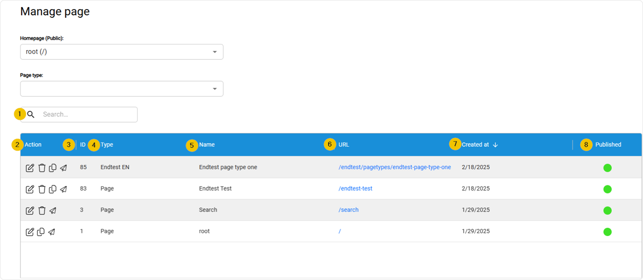
The following columns are available in detail:
| Function | Description |
|---|---|
| 1. Search | The search function allows you to search for keywords within the page overview. |
| 2. Action | Actions consists of several buttons: - switch to the edit mode (pencil symbol) of this page - Delete the page (trash can icon) - copying the page -withdraw the publication (paper airplane symbol) (Papierflieger-Symbol) |
| 3. ID | ID – Internal, unique, consecutively numbered number |
| 4. Type | The page types are listed here |
| 5. Name | Name - searchable internal page name |
| 6. URL | URL to page - links directly to the selected content page |
| 7. Created at | The SEO tab with search engine optimizations and meta settings for the current page |
| 8. Published | VPublication status - quickly recognizable by green (published) and red (not published) dots |
Hint: The date format of the creation date in Strapi is based on the language set in each case.
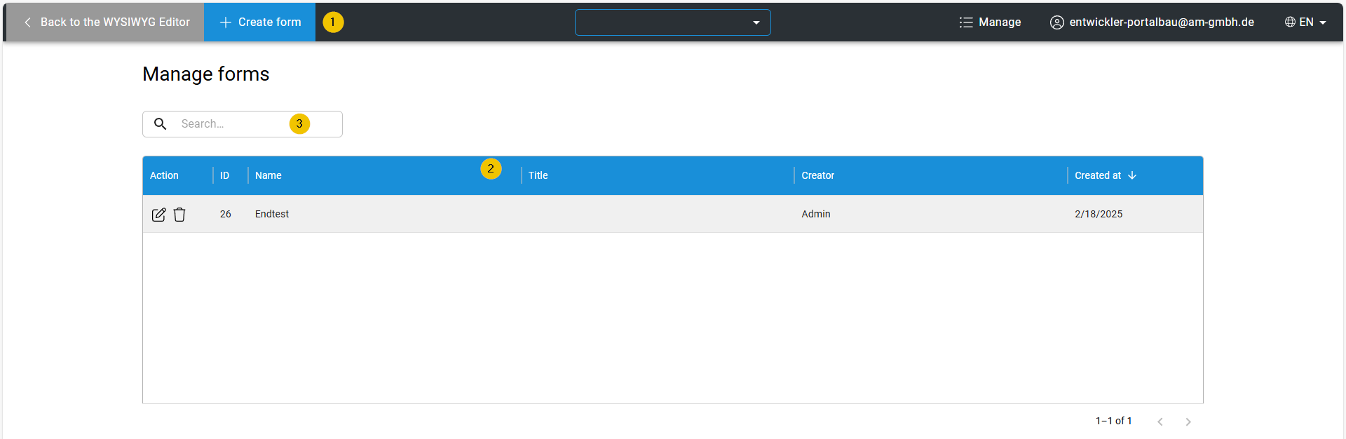
Formular Manager
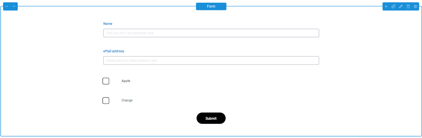
You use the Form Manager to create forms that can be placed on content pages using the "Form" content element.
| Function | Description |
|---|---|
| 1. Create Form | Use the "+ Create form" button to create a new form. |
| 2. Overview | This list contains the forms created to date with the following information: - ID of the form - Internal name of the form - Title of the form displayed on the page - Creator: Who created the form - Creation date of the form - Actions: You can edit or delete the form using the buttons. |
| 3. Search | The search function allows you to search for keywords within the form overview. |
Clicking on the "Create Form" button opens the input mask with which you can create the form according to your requirements.
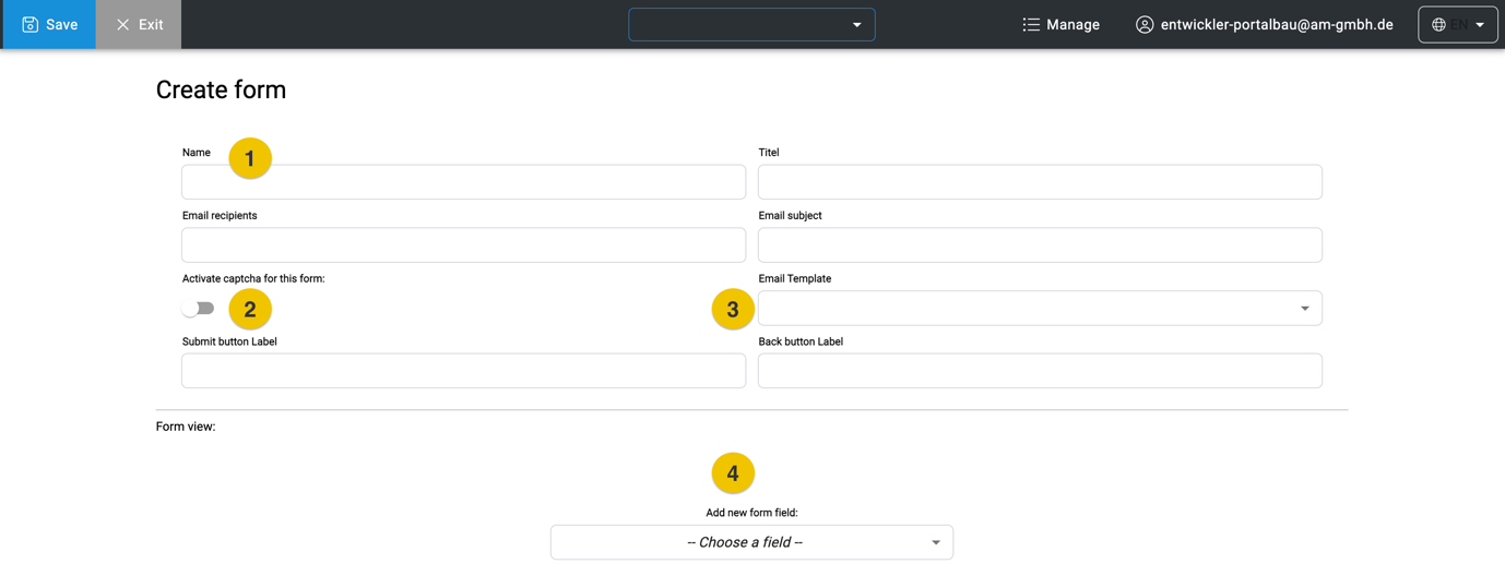
| Function | Description |
|---|---|
| 1. Header | This is where you enter all the relevant data for receiving the form data, such as the name and email address of the recipient who is to receive the user's data. You also enter the names for your submit and cancel buttons here. |
| 2. Captcha | Optionally, you can activate captcha protection. This appears when the "Form" content element is placed on the page, provided a captcha has been configured by a developer or designer in the Strapi backend. |
| 3. Email-Template | Drop-down menu for selecting existing templates for sending emails. The template is optional, as a default template is already stored. The designer or developer creates the email template in the backend. |
| 4. „Add new form field“-drop-down | Drop-down menu for form elements |
With your selection from the drop-down menu "Add new form field" you add all necessary fields to your desired form.
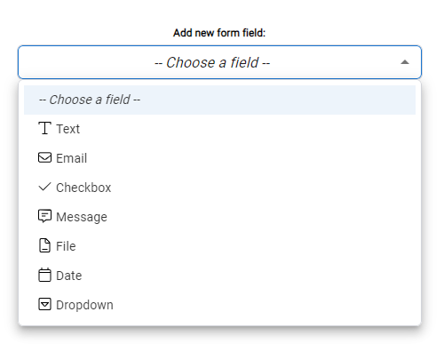
List of all form fields
These form fields are available in the dropdown.
| Function | Description |
|---|---|
| Text | A simple, single-line text field. |
| A single-line text field that you use to enter an email address | |
| Checkbox | Checkboxes allow your user to make a single selection using a labeled button. |
| Message | A multi-line text field that allows for longer messages. |
| File | "File" allows users to upload documents, images and videos and send them using the form. Various file formats are possible, which you can set via the Validation tab. |
| Date | "Date" allows the user to select a date via a picker in a calendar. |
| Dropdown | If you want to provide the user with various selection options, such as salutations, use the dropdown form field. |
Similar to the settings for content elements, you can make the various settings for the form fields here.
Learn: Further information on content elements can be found in Chapter 5 - Content elements
Hint: Fields such as the checkbox must be selected and configured again for each individual checkbox.
New fields appear directly above the drop-down menu and can be moved using the blue arrows on the right.
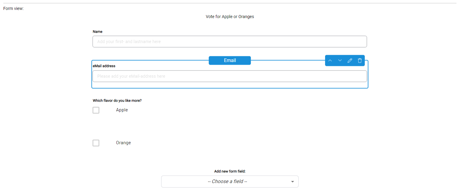
Let's take a closer look at one of the fields. In this example, the "Text" field has been selected.

Little can be seen there yet. You can make further edits using the pencil symbol. The settings differ depending on the type of field. However, there are always two tabs: "Field Settings" and "Validation".
„Field Settings“ tab
The "Field Settings" tab contains the following settings for the text field:
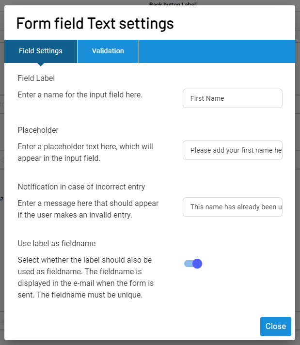
| Function | Description |
|---|---|
| Field Label | The name or heading of the input field. |
| Placeholder | A placeholder text that is displayed in the input field before users make entries. |
| Notification in case of incorrect entry | An error message that is displayed if the entry does not meet the validation requirements. |
| Use label as fieldname | Select whether the label should also be used as the field name. The field name is displayed in the email when the form is sent. The field name must be unique. |
"Validation“ Tab
The settings in the "Validation" tab are adapted to the field type. In the "Text" field, you can make several optional settings, while the "Email" field type only has the option of specifying the field as a mandatory field. This option is possible for every field.
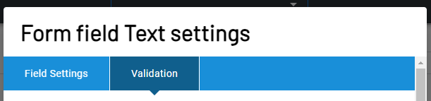
The following settings are possible for the "Text" example:
| Function | Description |
|---|---|
| Mandatory field | If activated, the user must fill in this input field, otherwise the form cannot be sent. |
| Minimum number of characters | Enter a numerical value here. The user must then enter at least this number of characters in the input field, otherwise the form cannot be sent. If the field remains empty, the form will not be checked. |
| Maximum number of characters | Enter a numerical value here. The user may not write more than this number of characters in the input field, otherwise the form cannot be sent. If the field is left blank, no validation will take place. |
| Do not allow letters | If this option is activated, the form cannot be sent as long as there are letters in the input field. |
| Do not allow numbers | If this option is activated, the form cannot be sent as long as there are numbers in the input field. |
| Do not allow special characters | If this option is activated, the form cannot be sent as long as the input field contains special characters. |
| Do not allow spaces | If this option is activated, the form cannot be sent as long as there are spaces in the input field. |
| Regular expression | Enter a regular expression to be used to validate the input (advanced validation option). Good knowledge of RegEx and extensive testing are essential here! |
Hint: The setting options listed here can also be found in the other form fields, but there are a few special cases that are now listed.
Form field settings „File“
There are two additional fields in the "File" form field that do not appear in the other validation tabs.
| Function | Description |
|---|---|
| Mandatory field | If activated, the user must fill in this input field, otherwise the form cannot be sent. |
| Allowed file extensions (.pdf, .png, ...) | Add file extensions here that should be allowed for uploading. You can use the standard checkboxes for file extensions, but you can also add additional extensions manually. The extensions are separated by a comma. |
| Max. file size in MB | Enter the maximum file size in MB here. If you leave the field empty, the maximum size is 4 MB. |
Form field settings „Date“
The form field "Date" also has additional fields that do not appear in the other validation tabs.
| Function | Description |
|---|---|
| Mandatory field | If activated, the user must fill in this input field, otherwise the form cannot be sent. |
| Allow selection maximum X days in the past | Enter days (integer) here to define a period that extends from the current day into the past. Only entries that fall within this period are permitted. No start date may be defined parallel to the usage. |
| Allow selection maximum X days into the future | Enter days (integer) here to define a period that extends from the current day into the future. Only entries that fall within this period are permitted. |
| Start date | Entries before this date are not permitted. |
| Not allowed period beginning | Define the start of a period here. Entries within this period are not permitted. The check only works if a start and an end have been defined for the period. |
| Not allowed period end | Define the end of a period here. Entries within this period are not permitted. The check only works if a start and an end have been defined for the period. |
„Dropdown Values“ Tab
The "Dropdown" form field has an additional tab where you can manage and create the individual dropdown entries.
| Function | Description |
|---|---|
| Dropdown options | Enter the options that should be available to the user in the dropdown list here. By default, the name and the value are identical. This means that the description of the option and the transferred value are identical. By activating the toggle switch, you can maintain different descriptions for the label and value. |
| Option Label and Value & add new option | Here you enter the value that is displayed in the dropdown. By activating the above-mentioned switch, you can enter different values for Label and Value. |
Place form as content element
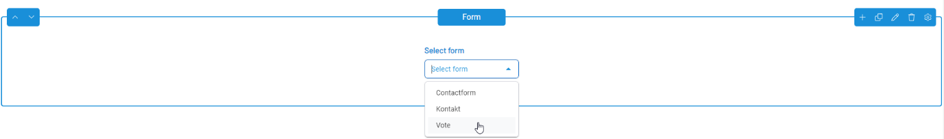
Once you have created and configured your desired fields, save the finished form with the "Save" button. It is placed on a content page via the "Form" content element.
Learn: Further information on content elements, such as the placement of content elements, can be found in Chapter 5 - Content elements
As you can create several forms, simply select your desired form from the drop-down menu.
Media Manager
The Media Manager allows you to efficiently manage files such as images, videos, audio and documents. These are integrated via the respective content elements.
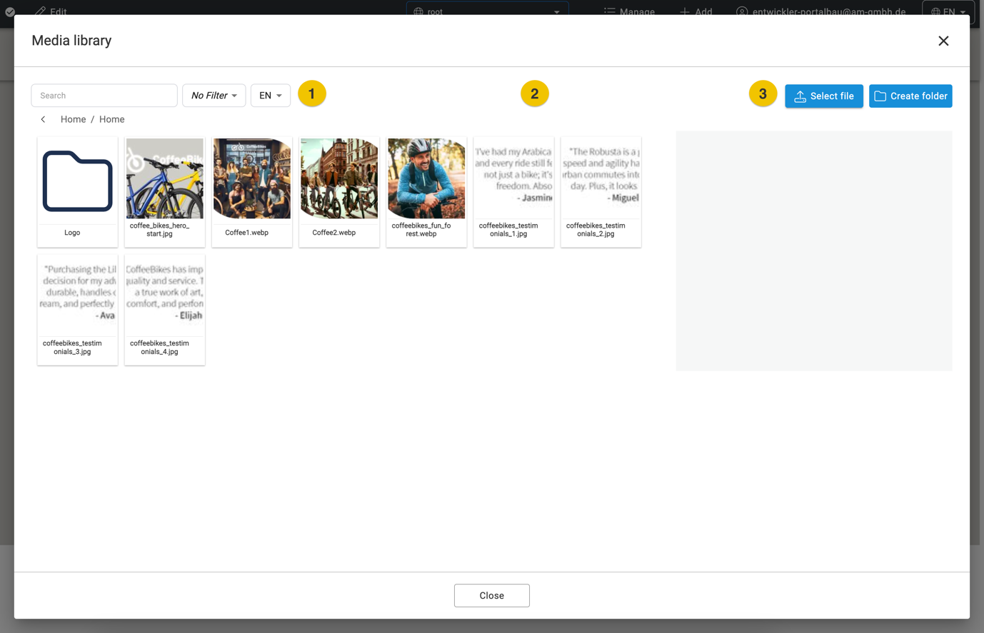
| Function | Description |
|---|---|
| 1. Search and Filter: | You can find the media you are looking for using the search function or filter the media to only display specific media types. |
| 2. General Overview: | Your uploaded files and folders are displayed with a preview (or the file icon) and further file information. Folders can be opened by double-clicking. |
| 3. Upload files and create a folder: | The "Select file" button opens the input mask for uploading new files. The "Create folder" button allows you to create a new folder. It is currently only possible to create or upload a folder or a file individually. |
Detailed view
The Media Manager allows you to enter and edit metadata for uploaded files. This includes information such as title, alt text and internal notes.
If you click on an already uploaded media file in the overview, the corresponding input mask opens on the right.
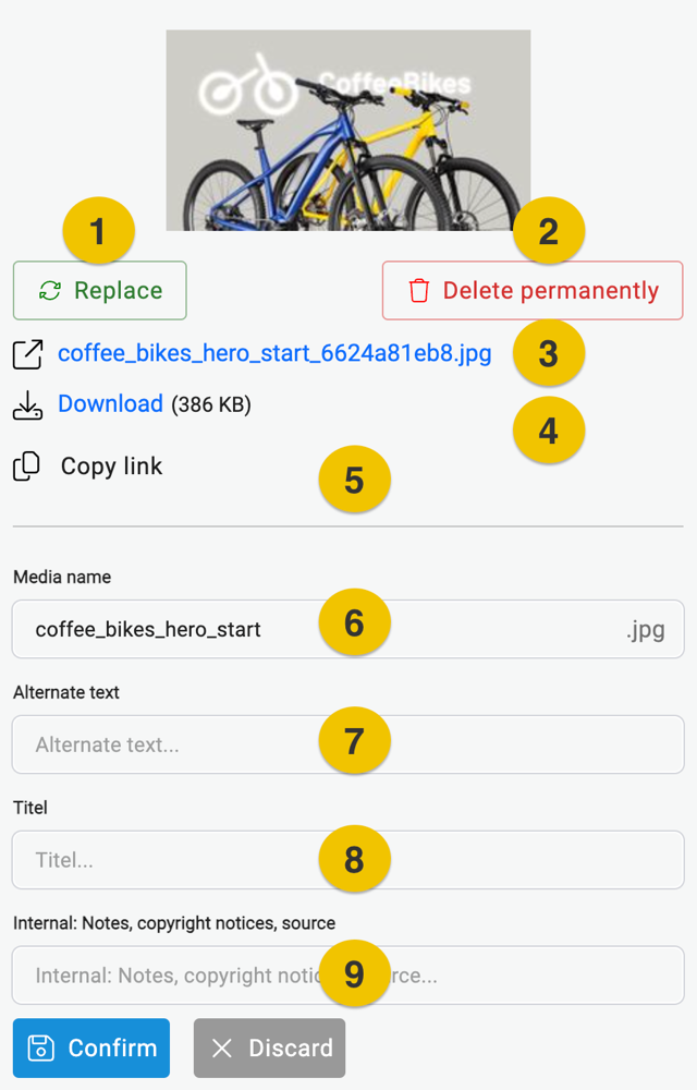
Various options and settings are available in this view.
| Function | Description |
|---|---|
| 1. Button Replace | The file can be replaced with another file using this button |
| 2. Button Delete permanently | Allows you to delete files permanently |
| 3. Open in a new tab | This link opens the image in full size in a new tab |
| 4. Download | Allows you to download the selected file |
| 5. Copy Link | The link to this file can be copied in this way |
| 6. Media name | The name of the file |
| 7. Alternate text | Alternative text that conveys the content of the image via Screen Reader or displays this text if the image is not displayed correctly |
| 8. Titel | Title of the image |
| 9. Internal: Notes, copyright notices, source | Notes, copyright notices, source Internal notes that are only displayed in this field, for example to note where a file comes from. |
Navigation
The website navigation in PageBuilder consists of a maximum of three levels. The navigation bar can optionally also contain the search function and the dropdown for changing the display language if multilingualism is set up.

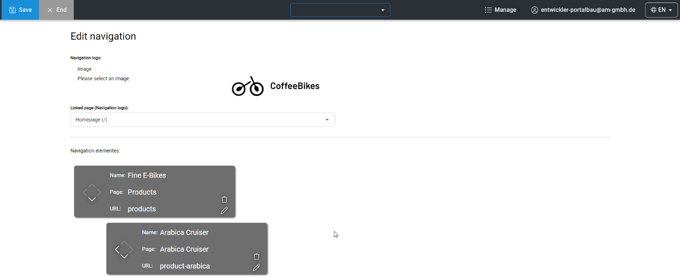
How to create and edit a new navigation
Use the "Manage" context menu to call up the navigation overview by clicking on "Manage Navigation". There you can also define the logo or another image, including a link, usually to the start page. Click on the image area to open the Media Manager, where you can select your logo or image. If you want to change your logo, you can do this by clicking on your logo again.
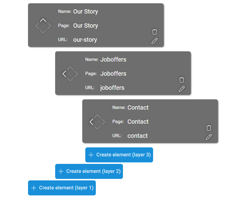
At the heart of the navigation are the menu items in the three layers. The "Create Element (layer x)" button is used to create new menu items in the respective layers.
In each element, you define the name (display name in the navigation) and the linked content page.
Hint: If a page does not yet have the status "Published", it can be selected at this point, but the link will not be displayed in the navigation until the page is published.
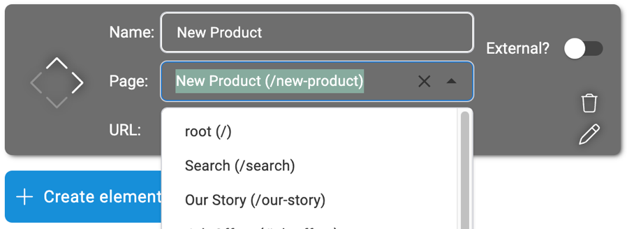
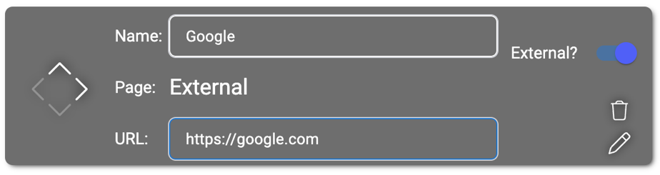
For external links, use the "External?" toggle and then enter the name and the external link.
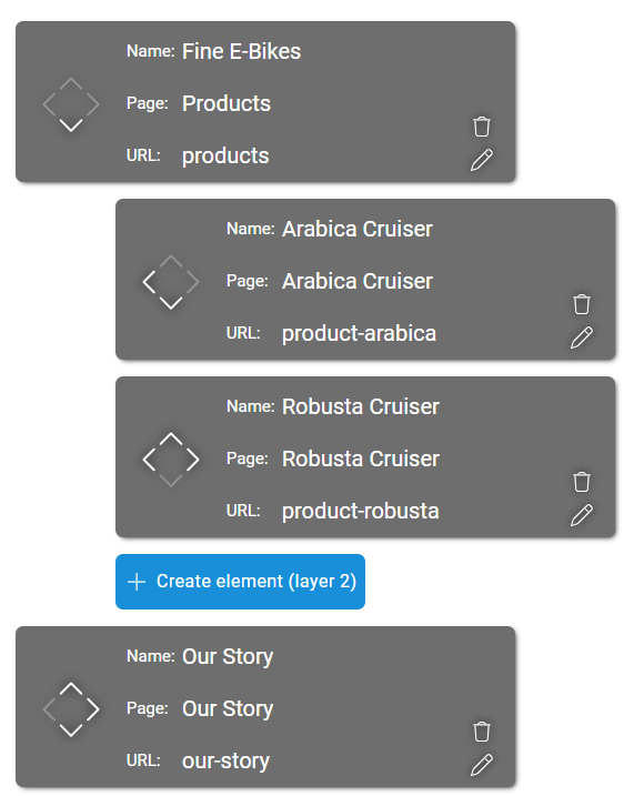
You can move the elements within the navigation hierarchy by clicking on the four arrows. This also allows you to define levels 1 to 3 within the navigation by clicking on the arrows in the respective direction.
In the example below, "Fine E-Bikes" is the first element on the first level - the main level in the navigation. All arrows except the down arrow are grayed out in this case, as there is no level 0 and the element is already at the top of the ranking list. As only the down arrow is active, this element can only be moved down and would swap places with "Our Story". Only after this swap do the other arrows become active so that this element can also be moved to level 2 or 3 if necessary.
You can move the navigation element "Arabica Cruiser" to level 1 - the main level - using the left arrow or you can change the order between "Arabica Cruiser" and "Robusta Cruiser" to level 2.
| Function | Description |
|---|---|
 | The pencil symbol allows you to edit the elements. Here you can adjust the name and link. |
 | Use the "Create element" button to add further elements to your navigation. This button appears for all layers that your navigation already has. (layer 1 and layer 2 in this example). |
4. Add
Use the "Add" context menu to create a new content page by clicking on "Add Page".
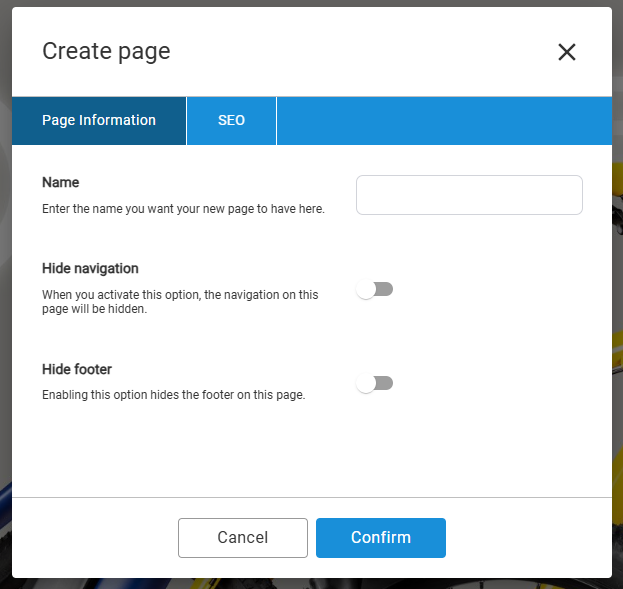
At the beginning, you only need to enter a name (internal designation). This short process is confirmed via the "Confirm" button and the page is immediately listed in the dropdown of all content pages, even if the page has not yet been published and is not linked.
You can change the name and URL as well as hide the navigation and footer of the new page at any time using the Settings button in edit mode.
Learn: Further information on editing the settings can be found in Chapter 1 - Editing mode under Settings.
5.Content elements
Texts, media and the dynamic arrangement of images, videos and text blocks can be placed on a content page using placed content elements. Pure design elements are also possible. Content elements can be moved in their order, customized and also deleted again. This is only possible within the editing mode of the content page.
Adding a new content element
The large "Add New Element" button is located at the bottom of a content page in edit mode. This opens an overview of all available content elements that you can add to your page. Click on an element to place it above the button on the page.
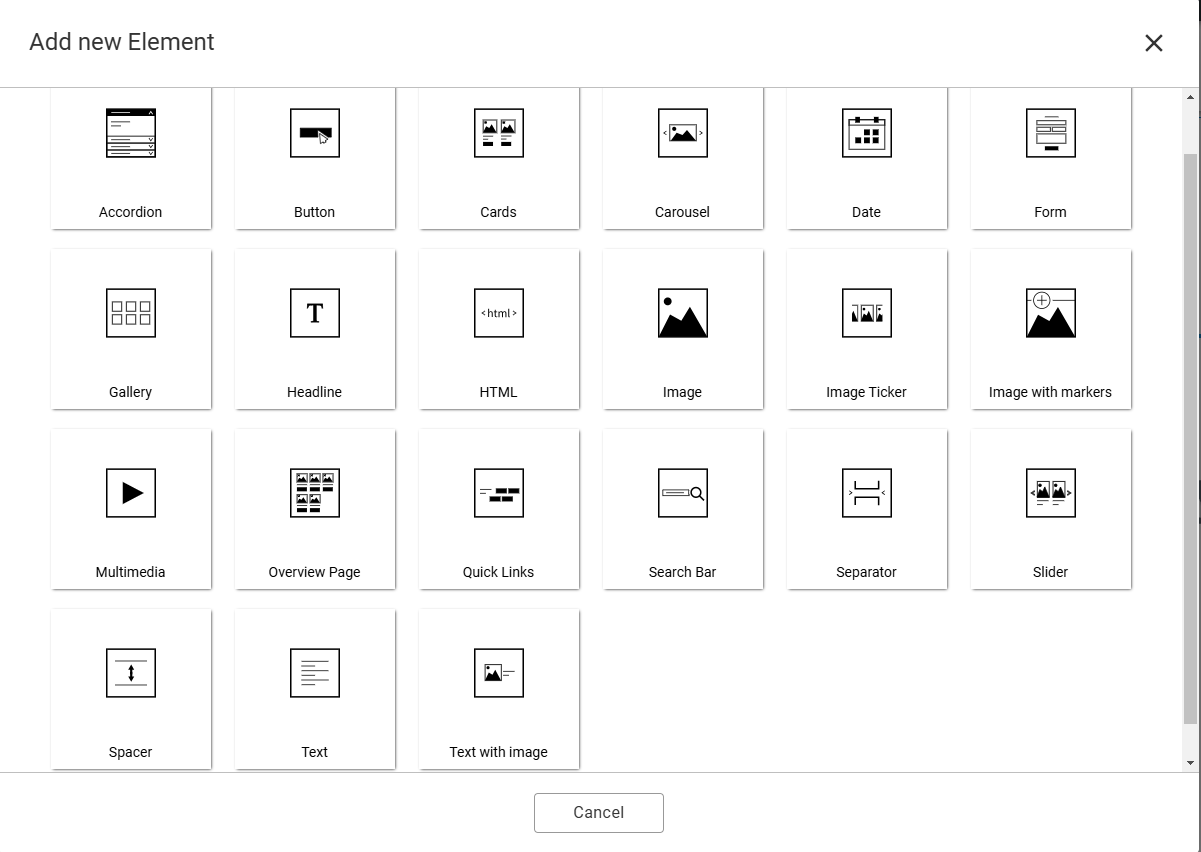
Overview of all content elements
| Function | Description |
|---|---|
 | Accordion: The content element is used to present extensive information in a small space, perfect for an FAQ. The user interface is not overloaded thanks to collapsible text sections. You can configure whether this happens automatically. |
 | Button: Certain functions such as navigating to other pages or triggering actions are activated on the website using the button element. |
 | Cards: Whether as teasers with links to other content or for clear data in the grid - cards can consist of images, headings, text and buttons. The integrated rich text editor gives you a free hand when designing the text. |
 | Carousel: A dynamic presentation of images within a content element is possible via the carousel. In addition to the classic function as a static header image, the carousel also provides a text editor and call-to-action elements for scrollable content teasers. |
 | Form: Your forms can be configured with the form manager and integrated on any number of content pages via the content element in the PageBuilder. |
 | Gallery: The gallery is perfect for presenting numerous media contents in a visually appealing way in a small space. The necessary image and video material is imported from the Media Manager. Several display formats offer you good integrity in your layout. |
 | Headline: In PageBuilder, it is possible to create an SEO-friendly headline hierarchy. With just a few clicks, page titles (H1) and subheadings (H2, H3, etc.) can be created in the content elements used. |
 | HTML: For more flexibility in the design and placement of elements, PageBuilder offers the option of placing HTML elements directly on the page. You can insert all valid HTML elements, including iframes, scripts and styles. |
 | Image: This content element is used to place individual images. Images are selected here via the MediaManager. The size can be changed afterwards. Small captions are also possible. |
 | Image Ticker: Either as an animated ticker tape or static image display, the image ticker shows many images in a row. Ideal for partner logos and references. The images can contain internal or external links. |
 | Image with markers: After selecting a suitable image via the options, you can place individual markers on the image and, if required, display text by clicking on the marker. Ideal for maps, floor plans and plans. |
 | Multimedia: Multimedia elements are a basic and important element on pages. They are used to display visual content and improve the user experience. Possible media in the multimedia element are images, playable audio files, YouTube and self-hosted videos. |
 | Separator: The section separator is a graphic element with CSS markup and therefore differs from the spacer. It is used to stylishly separate sections of a content page. This is achieved using predefined patterns such as waves, which enable a visual hierarchy to maintain the aesthetics of your content. |
 | Spacer: With the spacer, you create space so that content elements can be placed at a comfortable distance from each other. With individual dimensions and colors, nothing stands in the way of a modern UX design. |
 | Text: Simple text editing is possible with our rich text editor (RTE). This allows users to format and design texts without having to work directly with the HTML code. The integrated link chooser provides internal and external links in the text. |
 | Text with image: The text with image element consists of a rich text editor combined with a media element. Information can be presented in a visually appealing and understandable way. The use of subheadings is also possible. |
Editing content elements
Mouse over the element to be edited to reveal the blue editing frame with several buttons. Each element has different editing options depending on its type.
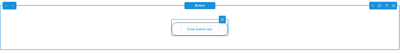
General editing options
| Function | Description |
|---|---|
 | Top left: The two arrows on the left-hand side allow you to change the order of the content element up or down. |
 | Top center: The name of the selected content element is always displayed in the middle. In the example, this is the content element "Button". |
 | Top right: At this point, there are various options for further editing the content element. You will find the following buttons there: |
| Function | Description |
|---|---|
 | Add: Another element is placed below the selected content element - the element selection window opens. |
 | Duplicate: The selected content element is copied and placed again below the selection, including settings, text and media. |
 | Edit: Behind the pencil is a window for further editing options. Example. For the content element Carousel, create the slides here. |
 | Delete: After clicking, a confirmation window appears. After your confirmation, the selected content element is deleted. |
 | Settings: Further options for the selected content element. For more information, see the subchapter Settings: The "Options" tab and Settings: The "Animations" tab. |
Settings: The "Options" tab“
Each content element has additional options via Settings that influence the appearance and behavior of the respective content element.
Learn: For more information on settings in the Strapi backend, please use the complete Settings documentation for the PageBuilder.
Each content element has different settings in some cases. For this reason, the most important settings that can be found in each content element are listed here.
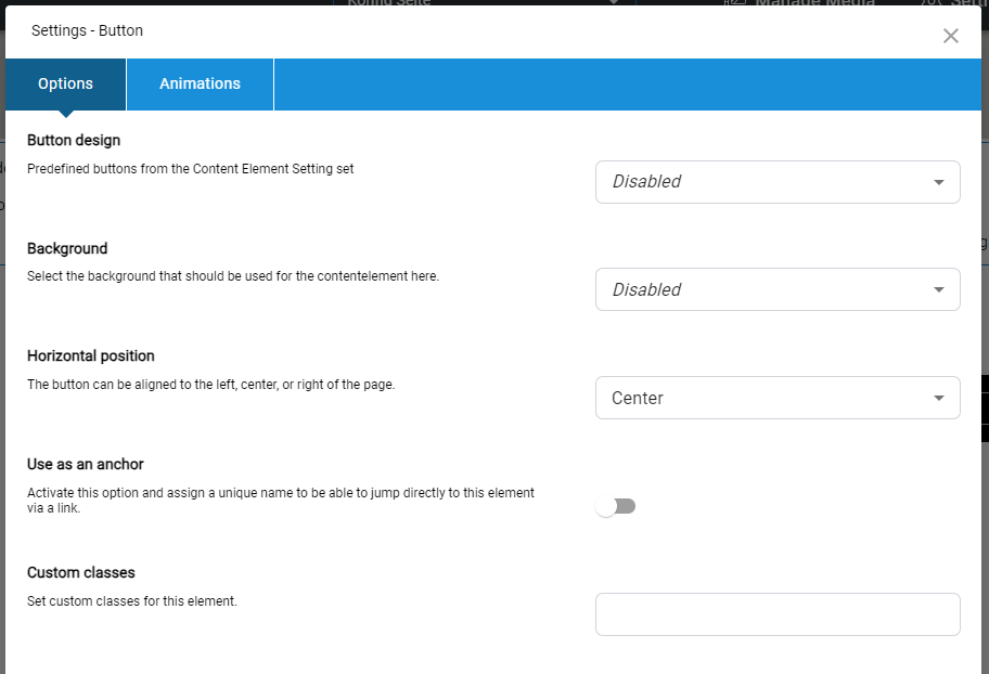
| Function | Description |
|---|---|
| Content-Element design | In this example, "Button design". Predefined appearance for content elements that have been defined by a designer or developer in the Strapi backend. |
| Background color | Selection of background colors that can be selected via a dropdown. This color only affects the background color of the selected content element. |
| Use as an anchor | Activate this option and assign a unique name to be able to jump directly to this element via a link. |
| Custom classes | Custom classes can be entered for content elements. This is done via Custom CSS, which is set by a developer or designer in the Strapi backend. This person will then also provide you with the class to enter. |
Warning: Only the most important options that are essential for the design of a content element or can be found in all content element options are listed here!
Hint: Some options under "Options" only appear if they have been configured by a developer or designer in the Strapi backend.
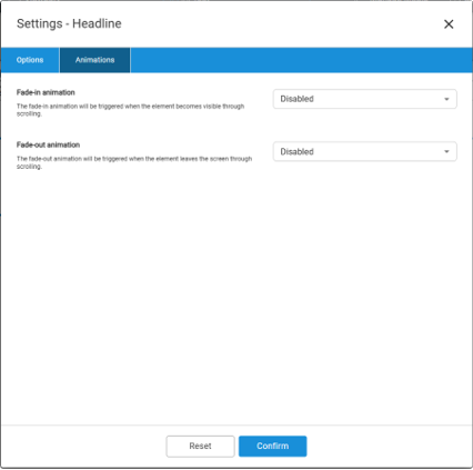
Settings: The „Animations“ tab
Get your content elements moving! Use the "Options" cogwheel button to access the "Animations" tab in the window. You can select the desired behavior from preconfigured animations in the dropdown to create dynamic movements. Testing is possible via the preview mode.
| Function | Description |
|---|---|
| Fade-in animation | As soon as a user has reached the height of the respective content element when scrolling the page, the selected animation is triggered and the element appears on your page in this way. |
| Fade-out animation | If users scroll past the content element, the fade-out animation is triggered and the element leaves the display area of your page. |
| Dropdown options | A wide range of options is available for both fade-in and fade-out animations. |
Animations must first be activated by you. They are switched off by default. If you would like to deactivate previously activated animations, please select "disabled" in the dropdown.