Strapi PageBuilder V.1.2
Hint: Make sure that you have followed the installation instructions and Strapi and Next.js have been started. **You can find the installation instructions on our website https://www.am-gmbh.de **
1. Store-, Global- and Content-Element-Settings
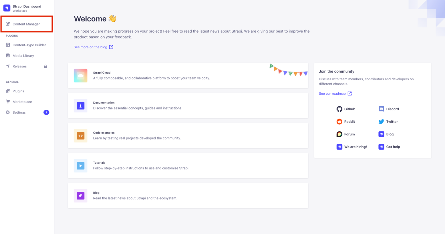
To access the settings, click on Content Manager after logging into the Strapi backend.
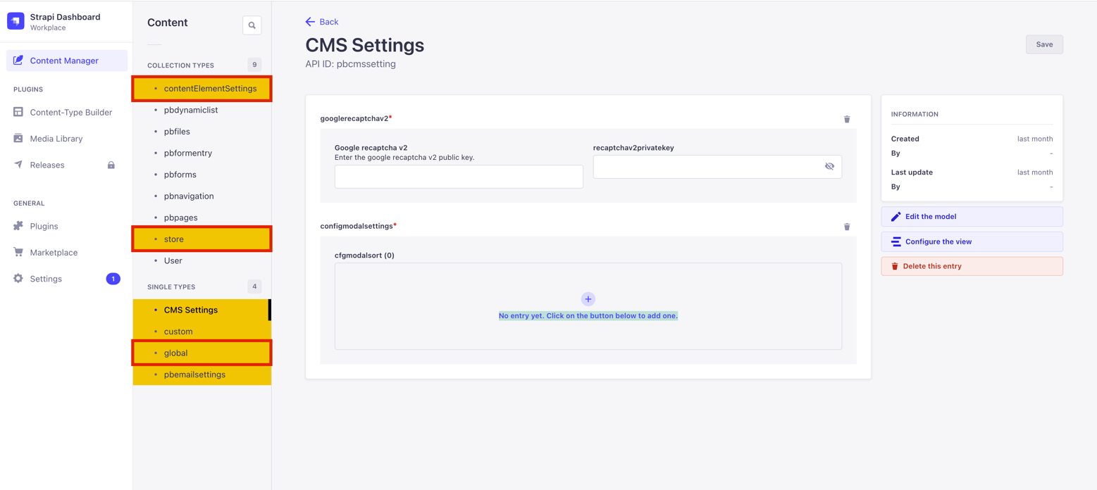
Menu level 2 of the PageBuilder backend contains several content types for which these three are mainly used:
- Store-Settings
The store settings are used to make basic settings for colors and fonts, which are then applied to content elements and global settings. - Global-Settings
With the global settings, you can make settings that affect the entire page. These include the size and color of the navigation or the width of a page with global background color and global spacing of the website - Content-Element-Settings
Content elements are individual modules that you can use to place a headline or images in the frontend, for example. To ensure that these correspond visually to your requirements, the modules are adapted in the content element settings and linked there to the predefined store settings.
| Rule of thumb | What should be adjusted? |
|---|---|
| No Content-Element | Search for setting in Global Settings |
| Content-Element | Search for setting in Content-Element Settings |
Learn: We look further into content types in the full PageBuilder Settings documentation on our website.
2. Store-Settings
The store settings are used in the store, global and content element settings. Below you can see the most important settings that are made in the PageBuilder backend:
| Element | Description |
|---|---|
| color | To define colors via color picker |
| font | Uploading and creating fonts in .ttf format |
| googleFont | Upload and create Google fonts via googleFontCssImport |
| typography | To create typography with the previously uploaded fonts to define a hierarchy of headline tags (H1 to H6) and paragraph (P tag). |
| richtext | Contains settings for text formatting, such as bold and left-alligned. You associate these later with the "richtext"-content-element. |
| button | Settings for buttons such as font, color, button width/height and hover effects |
| link | Settings for links such as font, color and hover effects are set here |
| background | Background images that you can later apply to content elements |
| arrows | The left and right arrows for the Carousel and Gallery content elements are defined here |
| spaceX | The horizontal (left/right) distance to the layout |
| spaceY | The vertical (top/bottom) distance to the elements above and below a content element |
Predefined default settings are installed when the PageBuilder is installed. You can adapt these to your needs. For the first steps, we will focus on the following three store settings:
| Store Setting | Description |
|---|---|
| color | Default-Settings: primary (dark and light), secondary (dark and light), accent and background (dark and light) colors. The primary color determines, for example, the color of the typography default component. |
| font | Allows you to upload your own fonts in .ttf format. |
| typography | Typography determines, among other things, the appearance of the HTML headline hierarchy H1 to H6, the font size of font formats and draws colors and fonts from the previously mentioned components color and font. |
Hint: You can recognize predefined default components for quick access by the specification (default) in the content type name. Example: button: button (default)
Learn: For more information, please use the full Settings documentation for the PageBuilder.
2.1 Edit Default-Settings
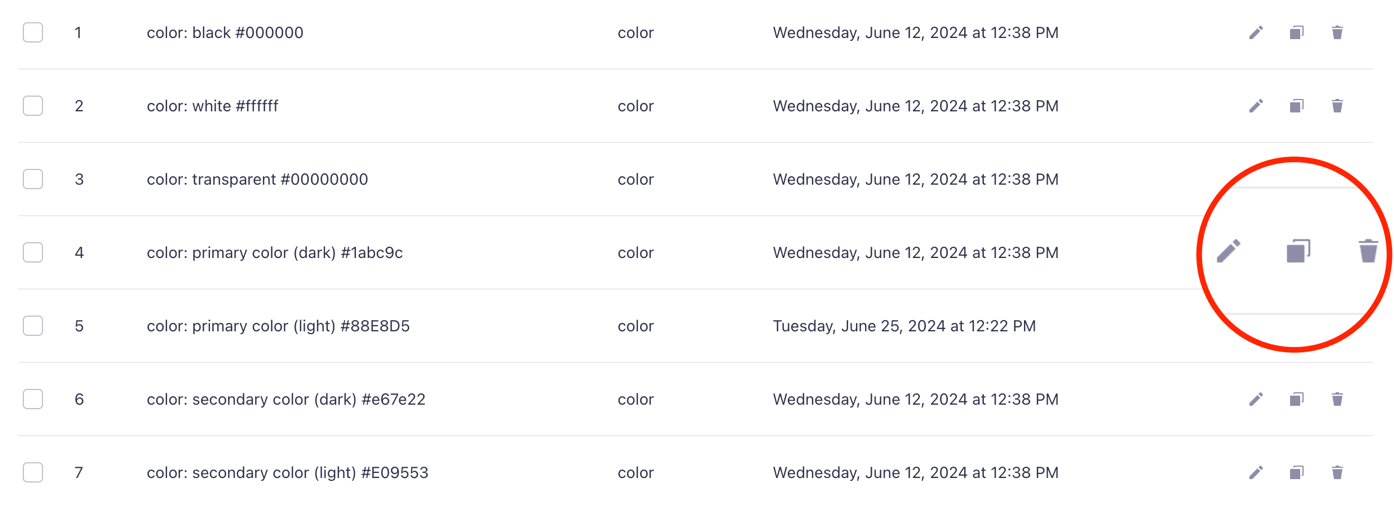
You can edit default settings. We explain the procedure using the store setting color as an example:
-
Open the store settings via the menu item store
-
Since primary color is used for the typography, we will adjust this default setting first. Use the pencil icon on the right to select color: primary color (dark) for editing.
-
The view switches to edit mode.
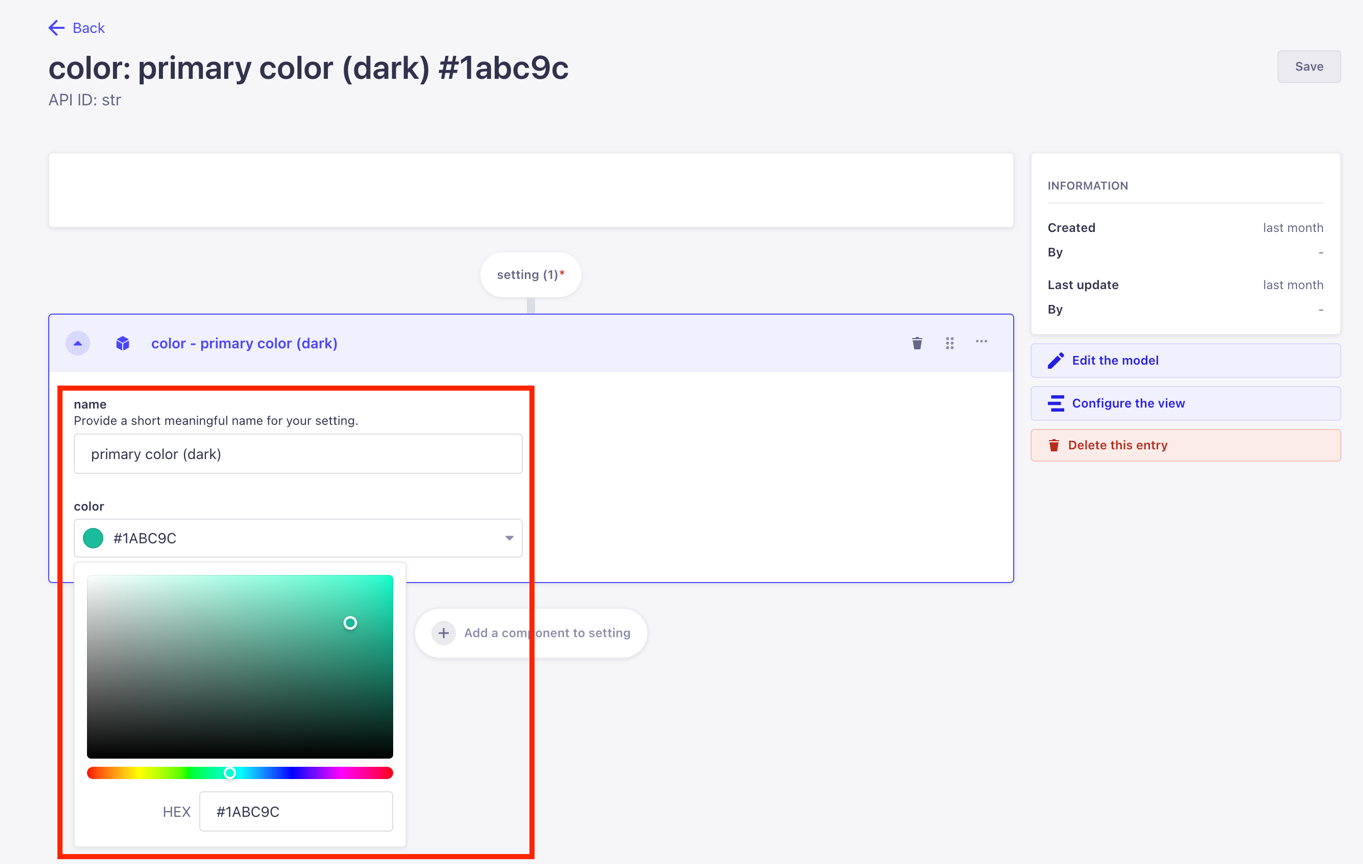
- You can assign a new name for the setting via the field name
Hint: We recommend using meaningful names to find settings more quickly and easily.
- Select the color in the field color – either using the color picker or by entering a valid HEX value.
- Click the Save button to save your changes. The first color is now adjusted.
- Now you can edit further default colors (e. g. secondary color)
Warn: After saving, the current editing view remains open! If you now enter new values, no new setting is created, but the currently open setting is edited.
2.2 Creating new Settings
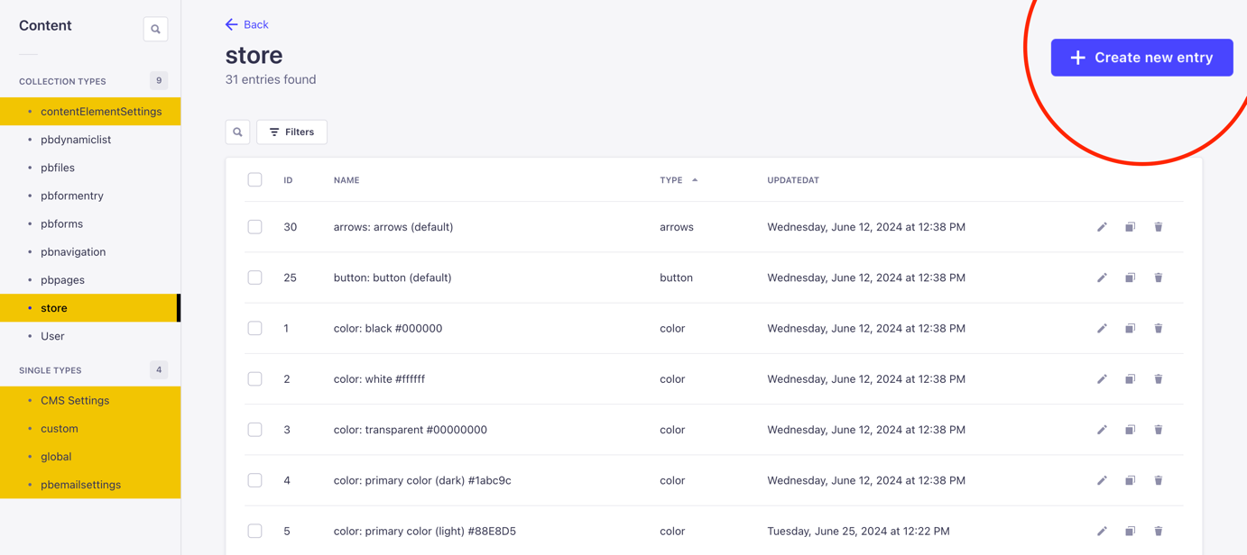
If the default colors supplied are not sufficient, you can create new store settings at any time:
- Open the store-settings using store.
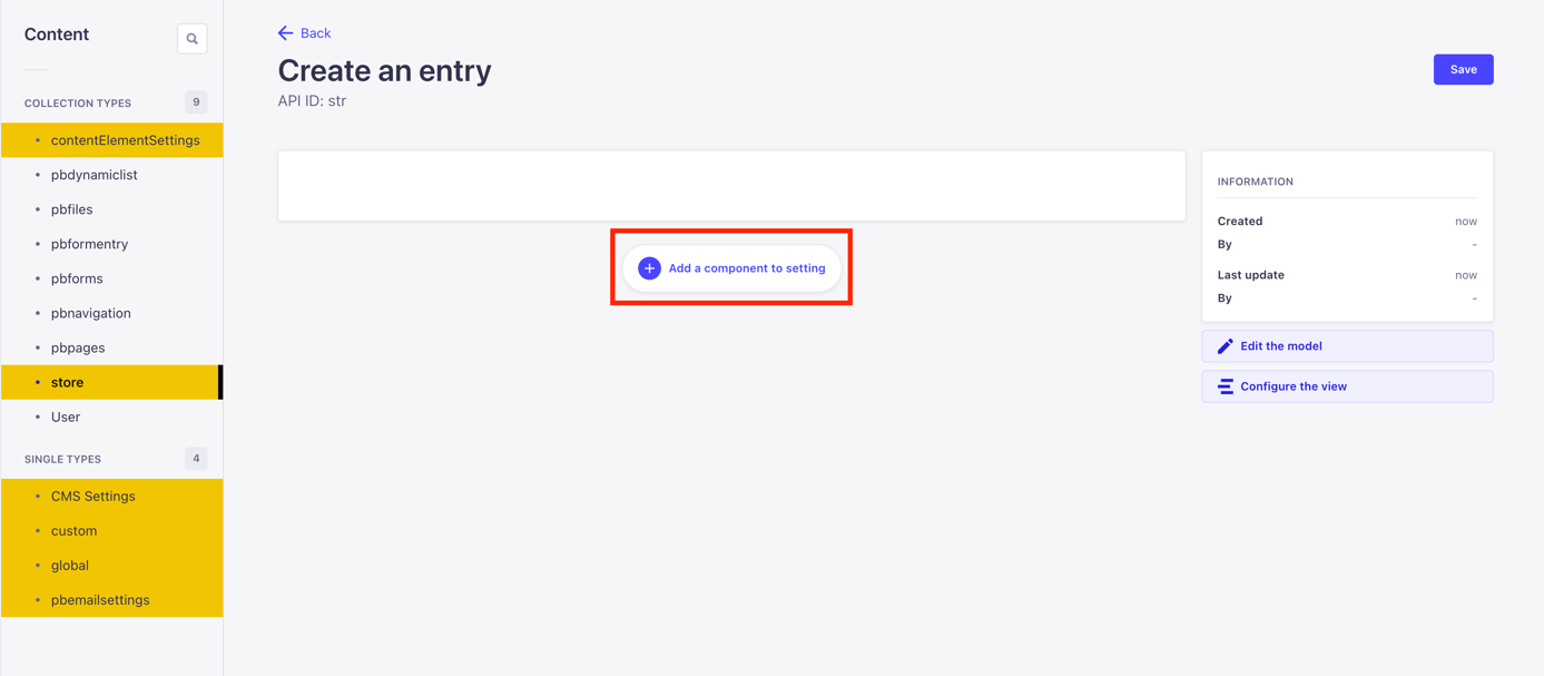
- Click on the button +create new entry and a new page will open.
- Click on the button add new component and the page now shows all available store settings.
- Select the desired component here, in this example color. The editing mode opens after selection.
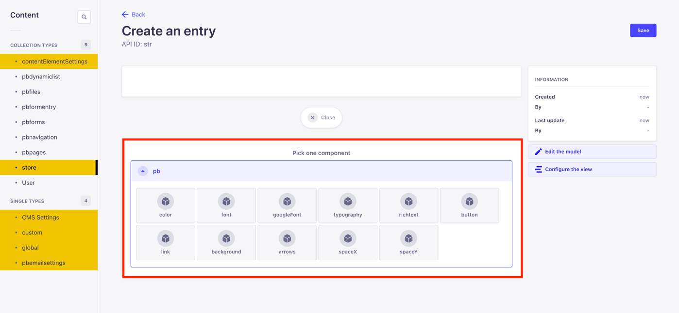
- As when editing store settings from chapter 2, enter a descriptive name in the name-field.
- Select the desired color from the color-field or enter a HEX value.
- Then save with the Save button.
Hint: The creation and editing of contentlEementSettings work in the same way.
2.3 Checking your first configurations in the frontend
As soon as you have adjusted the colors, fonts and typography, you can view the first results in the PageBuilder frontend.
- The CMS user login takes you to the PageBuilder frontend.
- Use the context menu Add > Add page to create a new content page. In edit mode, place new content elements using the large "Add new element" button.
Learn: Further information on the PageBuilder frontend and the individual content elements can be found in the detailed CMS documentation. A brief overview can be found here in chapter 4.
3. Global-Settings
This is where you make settings that affect your entire website. These include the size and color of the navigation or the background color via layout settings. To access the global settings, click on the global menu item in the PageBuilder backend.
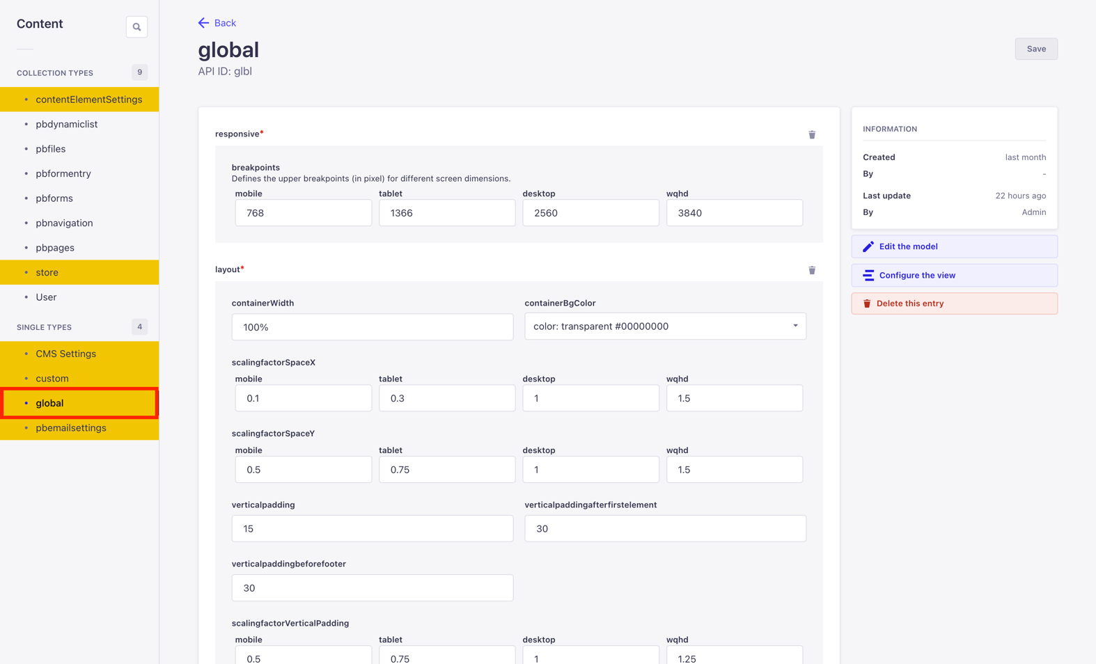
The settings options in the global settings also include, for example, the layout. The screenshot shows values for the width of a page as well as the global background color and global spacing.
Further setting options in the global settings:
- Responsive
- searchresults
- Layout
- multilanguage
- Navigation
- animation
- footer
- scrolling
- Seo
- scrolltotop
- Logo
- captchatype
- forms
- sanitizing
- Search
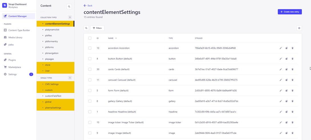
4. Content-Element-Settings
You use the content elements to place elements such as headlines or images on your page in the PageBuilder frontend. Prior to content management, configurations are made in the PageBuilder backend.
To access the content element settings in the backend, click on contentElementSettings in the menu.
Within the content elements in the PageBuilder frontend, you will find further settings in the configuration modals that were previously defined in the backend via the store and content element settings. These include colors, fonts and typography.
Depending on their role assignment, development and/or designers determine the layout decisions (colors, fonts and typography) in the PageBuilder backend, which are available to the content management in the frontend via configuration modals. The content manager cannot decide for themself whether a certain font or color is used in the frontend for content elements, if it has not been set accordingly in the backend. In this way, use is restricted to approved elements that correspond to your desired corporate identity. This way, incorrect decisions are prevented.
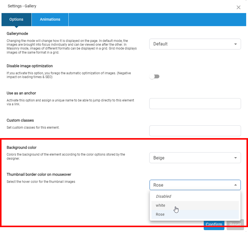
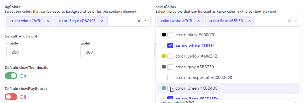
The following example illustrates the effects of design decisions on colors selected for the gallery content element:
- All colors that were created in the store settings in the hoverColors dropdown are available for the gallery content element in the PageBuilder backend.
-
Now you decided to make only the colors white and rose available as hoverColors-options for the content management. In the bgColors field these are the colors white and beige.
-
If the content management in the PageBuilder frontend opens the configuration modal for the content element gallery, there are only the bgColors options white and beige in the pool of created colors for hoverColors, as selected and shown in the screenshot, white and rose.